

ABELLIMENTO VIOLIN STUDIO
Visual Branding, Print + Social Media Imagery, Squarespace Website Design
Abigail knew it was time for a fresh new brand for her violin studio in Milwaukee, Wisconsin. After developing and growing her studio and student base for a number of years, she was getting ready for even more growth and new project ventures... and with her website and brand just not feeling like "her" or fitting her needs anymore, she felt it was time for a change.
Abellimento Violin Studio focuses on the Suzuki method, an internationally known violin curriculum that "creates an innovative, motivational, and curiosity-driven environment for enhanced music education." It's a holistic approach to teaching, through which children develop a deep love of music and respect of all people. So, it was important that we reflect that holistic approach visually. Abigail had a slightly organic boho look and feel in mind, which I thought was a fun and appropriate visual direction to head. It was also important to keep her audience in mind -- her students and (perhaps most importantly) parents and families who are wanting to invest in their child's music education. Professionalism, as always, was important too.
Together, we developed a joyful, nurturing, approachable brand styling with a slightly organic touch, while also remaining professional and evoking trustworthiness. The tall serif font used for "Abellimento" in the logo has a slightly vintage boho feel, paired with the handwritten script font for "Violin Studio" that adds a comfortable modern flair. The violin shape is a recurring element throughout the logo variations and marks, connecting back to the heart of what Abigail offers and grounding the logo designs. The color palette evokes a calm happiness -- rooted in neutrals and the muted blues, with sparks of youthfulness and joy in the yellow and green.
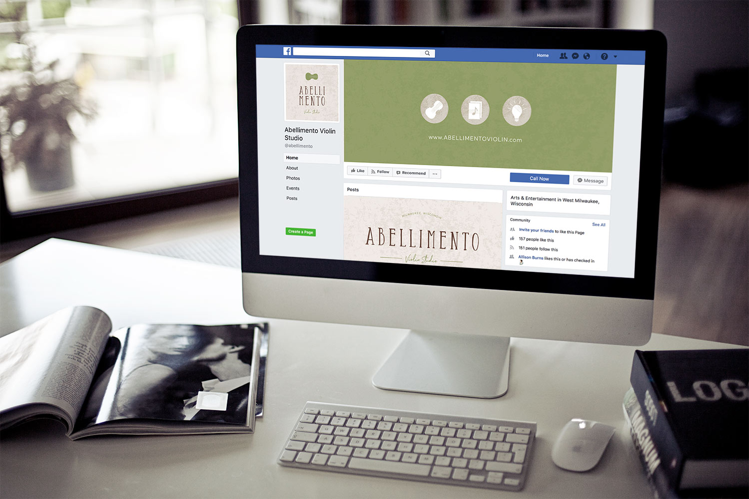
Additional design elements give depth and personality to Abigail's visual brand. The earthy patterns and textures serve as nice backgrounds and the tagline mark further emphasizes her teaching method and studio location. The custom web icons were designed to represent her main offering (violin lessons and the Suzuki method), her investment in students' musical development (music sheets / music note), and the unique lesson experience she gives, tailored to how each child learns (lightbulb). These icons accompany text on her website that describes those different values/facets of Abellimento Violin Studio's mission.
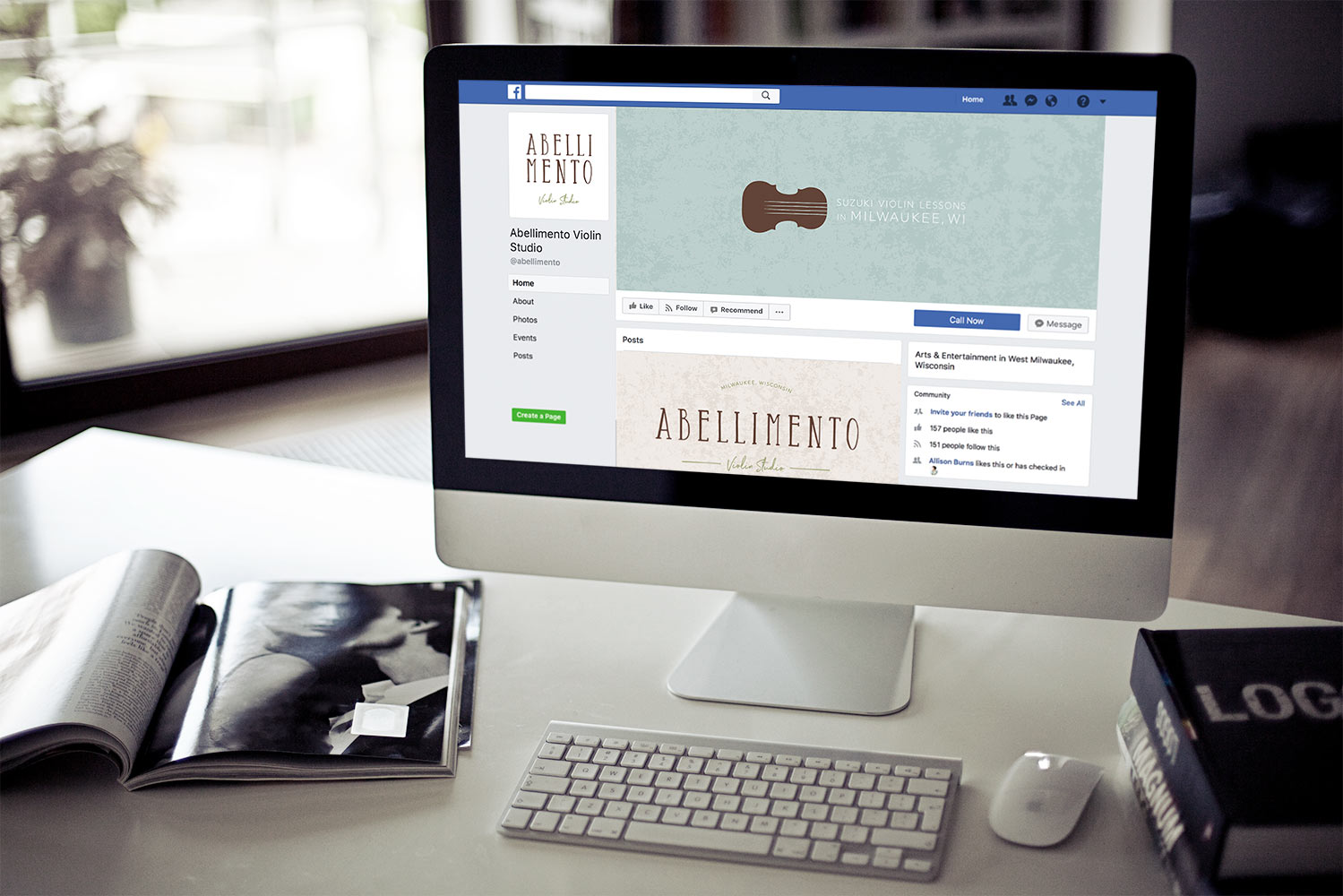
The brand styling remains consistent and beautiful in the letterhead, envelope and business card designs. All the print materials feel professional and fun, while showing off Abellimento's personality. Below, you'll see this consistency carries over into social media imagery too, creating unity and professionalism.
Abigail craved a website that was easy for her families to use and for her to update throughout the year. Her Squarespace site does just that! It was a pleasure to collaborate with Kayla Hollatz on the website copy -- together with Abigail, we developed a design, copywriting, and user experience that have an ease that's very much in line with Abellimento's brand. It clearly communicates Abigail's mission, vision, and what makes her unique, and also serves her current families with a password protected page with resources just for them. I love how the textures, icons, logos and marks all work together to create a beautiful visual experience, too. Check out the live site!
INTERESTED IN COLLABORATING ON YOUR NEW VISUAL BRAND?
BUSINESS CARDS + LETTERHEAD DESIGN

SOCIAL MEDIA GRAPHICS


SQUARESPACE WEBSITE DESIGN

