Cart 0


Asset 2.png
 

CHE

Logo + Visual Identity
Letterhead
Notecards
Envelopes and Labels
Branded Stickers


About the client

CHE is a boutique bookkeeping firm providing high level and customized bookkeeping, office management, and property management services by experienced professional bookkeepers and managers. Established in 1985, CHE is a trusted back office for their clients, offering excellent (and often daily!) service and connection which allows their clients to focus on what they are passionate about, knowing the financial health of their business is carefully monitored and they’re being professionally cared for. Their knowledgeable and personable team truly cares about their clients’ success and is there to support them every step of the way as they grow.

About the brand

CHE came to me needing a brand overhaul to help them put their best foot forward as they continue to market themselves, impress referrals, and move toward their big picture business goals. Simply put, their old brand didn’t match the high level of service they provide. It was time for a new visual identity that better communicated their value, expertise, and the trust they build with their clients.
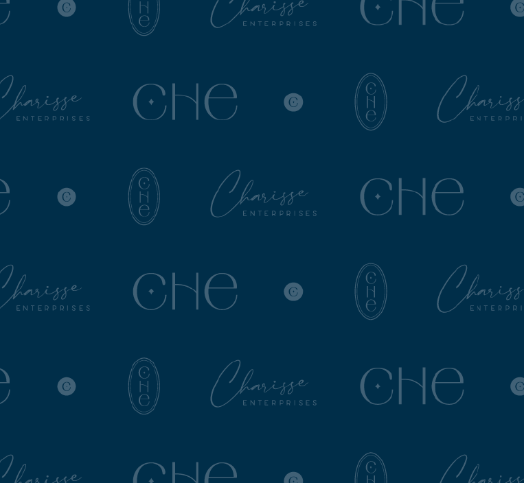
We set out to develop a brand that was classy and elegant, and emphasized their identity as a boutique firm that is knowledgeable, reliable, and also personable. The logo lettering has an art deco vibe (very “boutique-chic”!) and the combo of customized upper and lowercase rounded letters adds an approachable touch, while also speaking to the personalized experience that the CHE team gives each of their clients. The little star inside the C was inspired by the idea of protecting clients’ “treasure” (a recurring theme in our conversations) as well as the detail-orientedness and polish that the team brings to their work. The patterns and textures add depth and interest to their marketing designs and further emphasize their professionalism and warm personalities.