
Ira Briones
Logo + Visual Identity
Social Media Imagery
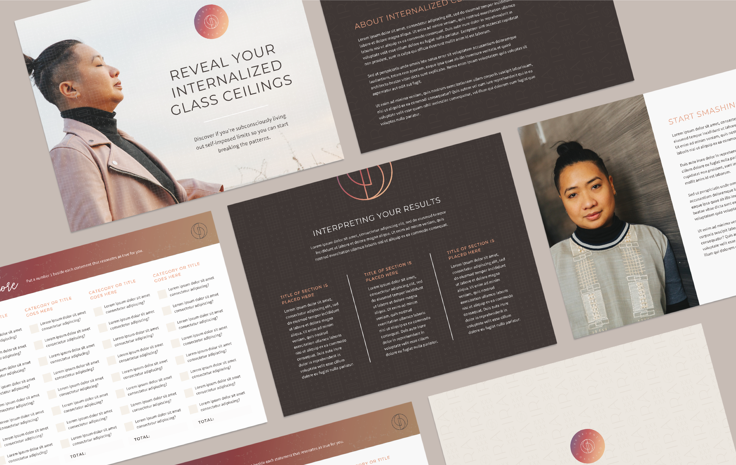
Lead Magnet Template
Coaching Client Templates
ABOUT THE CLIENT
Ira is a business energy coach that helps historically marginalized entrepreneurs access their inherent power and transcend conditioned limits so they can create and maintain success that ripples out into the rest of their lives and their communities. Ira believes that together, they can be part of a compassion- and abundance-based path to creating more justice and equity in the world.
After a successful first year in business, Ira was ready for a full new brand identity that felt aligned with their mission and values, and authentically captured who and what they have grown into in their business. We set out to create a visual identity that has a beautiful blend of minimal, grounded, and holistic, with a creative edge. A brand that felt equal parts compassionate and powerful, reflective and strong, clean and artistic.
Branding photography by Mengwen Cao.


INSPO BEHIND THE DESIGN
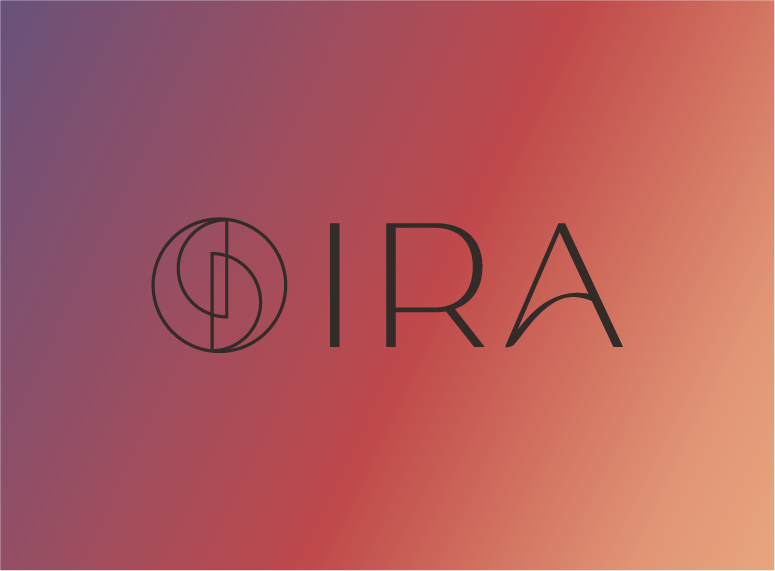
The brand mark reflects Ira’s sound work (resembling sound bowls) and the transformative journey their clients experience.
While the gradient draws inspiration from Ira’s love of sunsets and their energetic, spiritual approach to coaching. It adds depth and dimension and makes the logo lettering come alive, evoking creativity, spirituality, and reflection.


INSPO BEHIND THE DESIGN


