
A Beginner’s Guide to Typography
Typography is defined as the arrangement of letters in a design.
The art of typography includes selecting typefaces/fonts, choosing the size and spacing of the letters, and its placement within the design. It’s incredible how much personality a typeface can have and how the perfect typeface selection can truly make your design. That’s why typography is one of my favorite aspects of graphic design and one of the things I enjoy most about my job as a branding designer!
When you have the tools and knowledge to expertly use typography in your brand and visual marketing, your graphics and collateral will not only look better -- it will also help you intentionally (and beautifully!) communicate your message and connect to your audience. In this post, I’m going to help you learn the basics so you can incorporate typography in a more engaging way throughout your designs.
But first…
why does typography matter?
When you think about a major brand like Coca Cola, I’m sure you’re thinking about the red of the Coke can AND envisioning the script font that is a part of the branding design.
Or how about the Coach brand. When I hear that brand name, I think of their luxury bags (of course) and their bold serif font with the capital C pattern that appears on their bags and throughout their marketing.
Walt Disney, The New York Times, Nike, Visa...there are so many logos out there that are rooted in strong and memorable typography choices, and the style of the letters have become synonymous with the brand itself!
This is why typography matters.
Using typography in an engaging and consistent way has helped companies — big and small — build brand recognition.
And, as we know, brand recognition leads to connecting with your audience, which leads to clients/customers investing in you...which is the ultimate goal, right? And this goes beyond logo design. It’s equally important to use typography consistently throughout your small business marketing by creating a font system (more on this below).
So, what kind of an impact does typography have on your brand? It plays a big role, including:
Helps to attract the attention of your audience
Helps to convey your message in an engaging way
Helps to set the tone of your design and works together with your other elements (color, photography, etc.) to create an emotional response
Using consistent font selections in your marketing will help you look more cohesive and intentional with your visuals… not to mention professional!
Let’s start with the basics…
Typeface vs. Font
I use these terms interchangeably but there is actually a difference between the two worth noting. While typeface is considered the actual design of a set of letters, font is defined as a file that generates a particular style of letters in a given typeface. So, the file you download onto your computer when you want to use a certain typeface? That file is, again, technically speaking, the actual font.
Different types of fonts/typefaces:
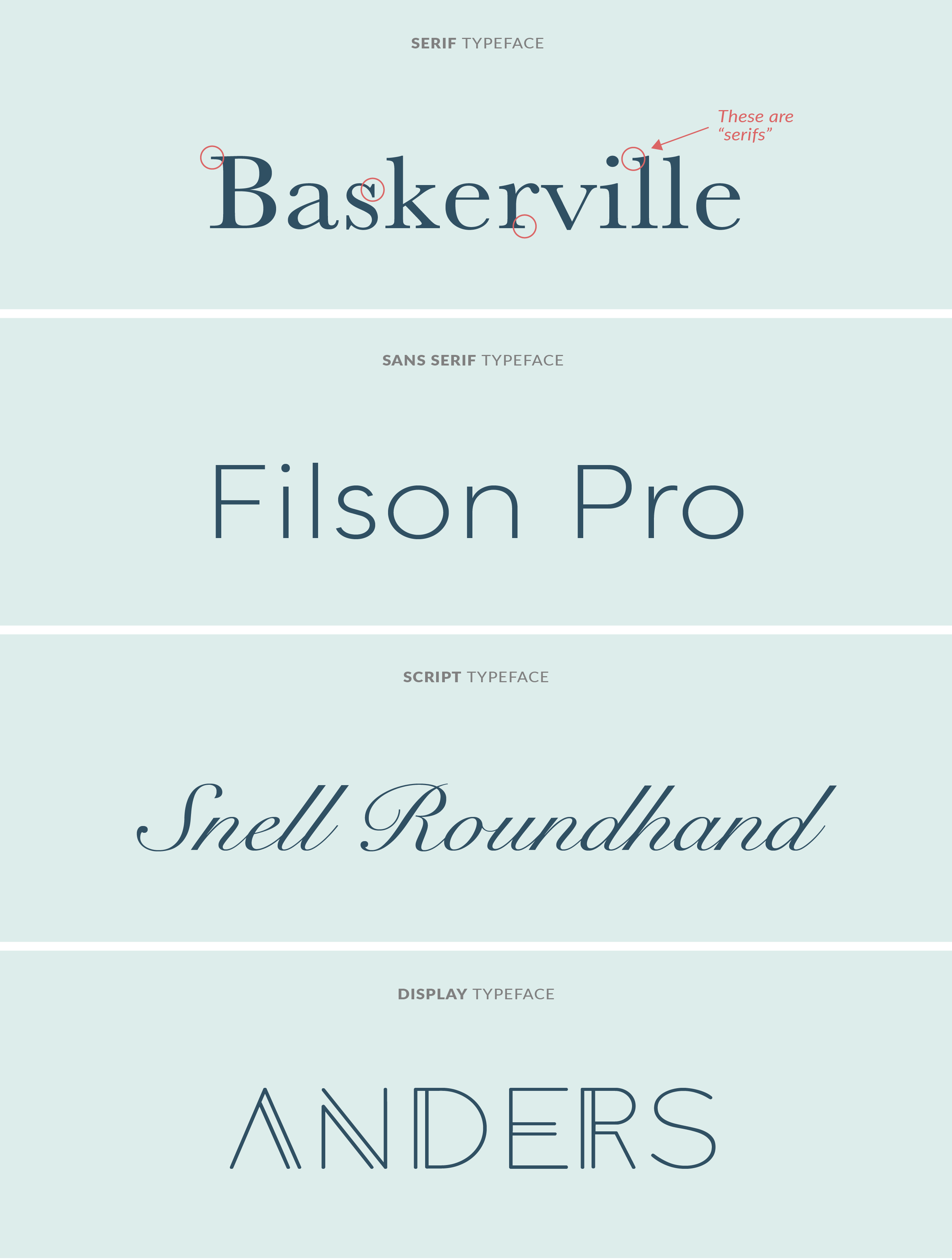
Serif
The small lines/strokes attached to the end of letters are called “serifs” (see graphic for reference). Any font that has them is referred to as a serif font.
Sans Serif
A sans serif font is one where the tips of the letters are plain and they don’t have a serif. Sans means “without.”
Script
Script fonts can take on many different personalities and styles (modern, handwritten, etc.). But as a whole, you'll recognize them by how their letters are linked together in some way, like cursive.
Display
Display fonts are designed to be used for titles and sometimes logos. They can help create a point of emphasis in your designs and/or convey a specific mood or feeling with their unique and notable style.
Now that we know the basics, let’s dig deeper.
How you actually USE typography effectively + consistently is just as important as and will lead you to make better design decisions.
Creating a font system
What is a font system?
A font system is an intentionally chosen set of fonts that tell you what font you use and for what purpose. Each font you use should have a role and responsibility assigned to it!
How to create a font system
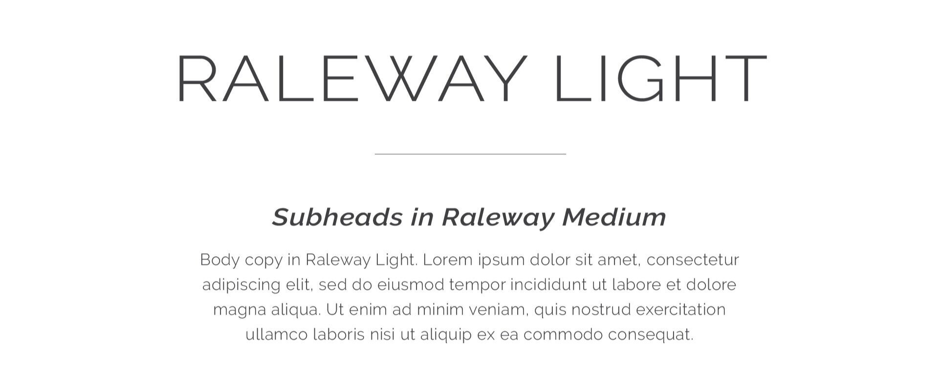
Assign a font for your headers, subheads, and body/paragraph copy. You could also add one for callouts/accents/calls to action, if you wish and it’s a good fit for your marketing.
Here’s an example:
Ensure good hierarchy -- your headers should attract attention first, then subheads, then body copy. You can create hierarchy with size, color, and/or style of the letters (bold, italics, upper/lowercase letters, etc.). Essentially, you will have a different size, color and style for each font, to fit its purpose. So when you’re creating your own font system, feel free to experiment with uppercase and lowercase letters, bolding fonts, or using italics for emphasis, etc.
These slight changes can help you create a great hierarchy and your text will flow nicely in your designs!
Creating a font system has everything to do with pairing fonts. And the key to pairing fonts is creating contrast!
I consider there to be two main methods to creating contrast in your font system:
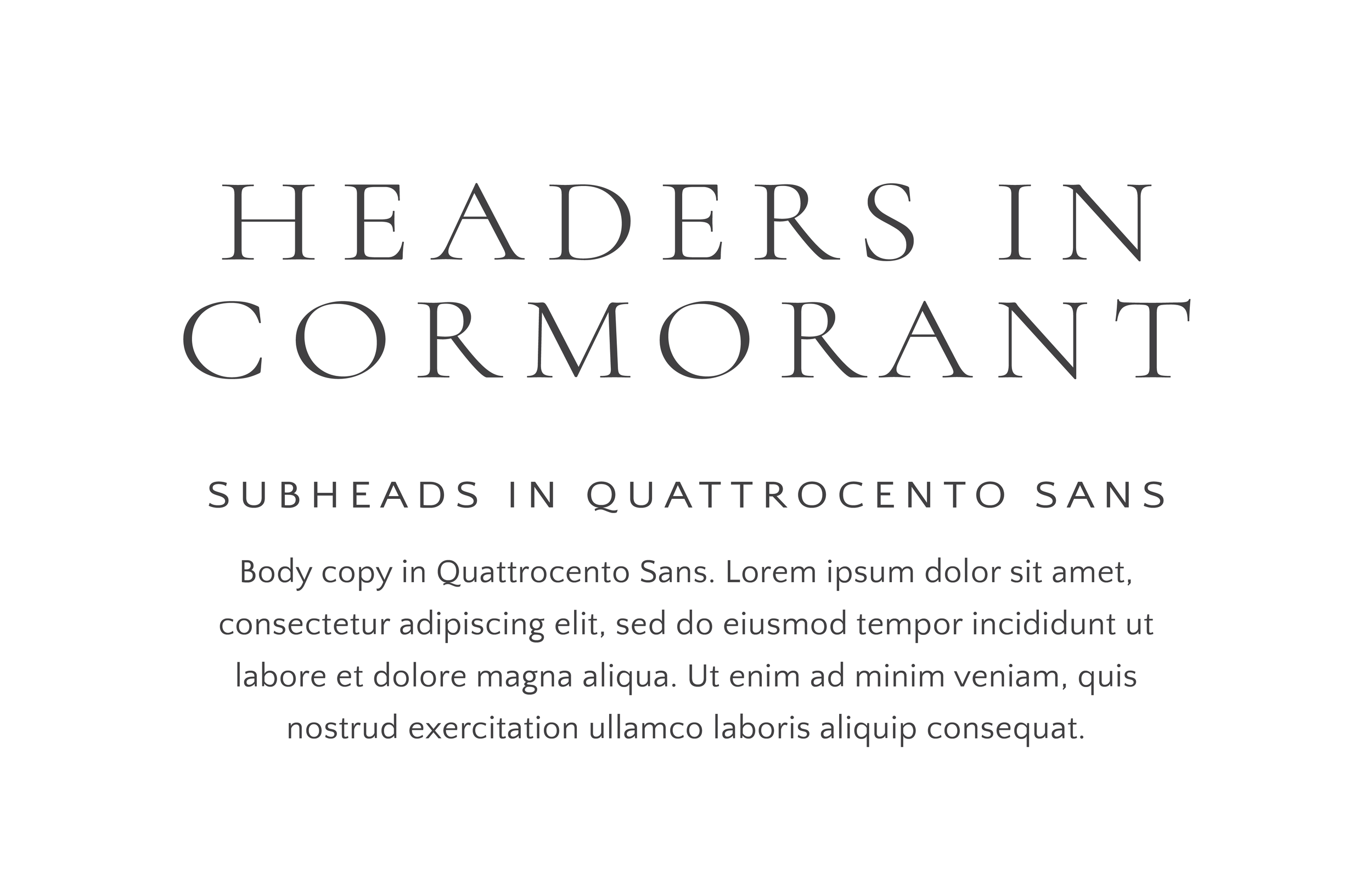
Method #1: Work within one font family
Choose a font family that you like and create visual contrast using the different weights or variations of the font.
Example using the Raleway font family:
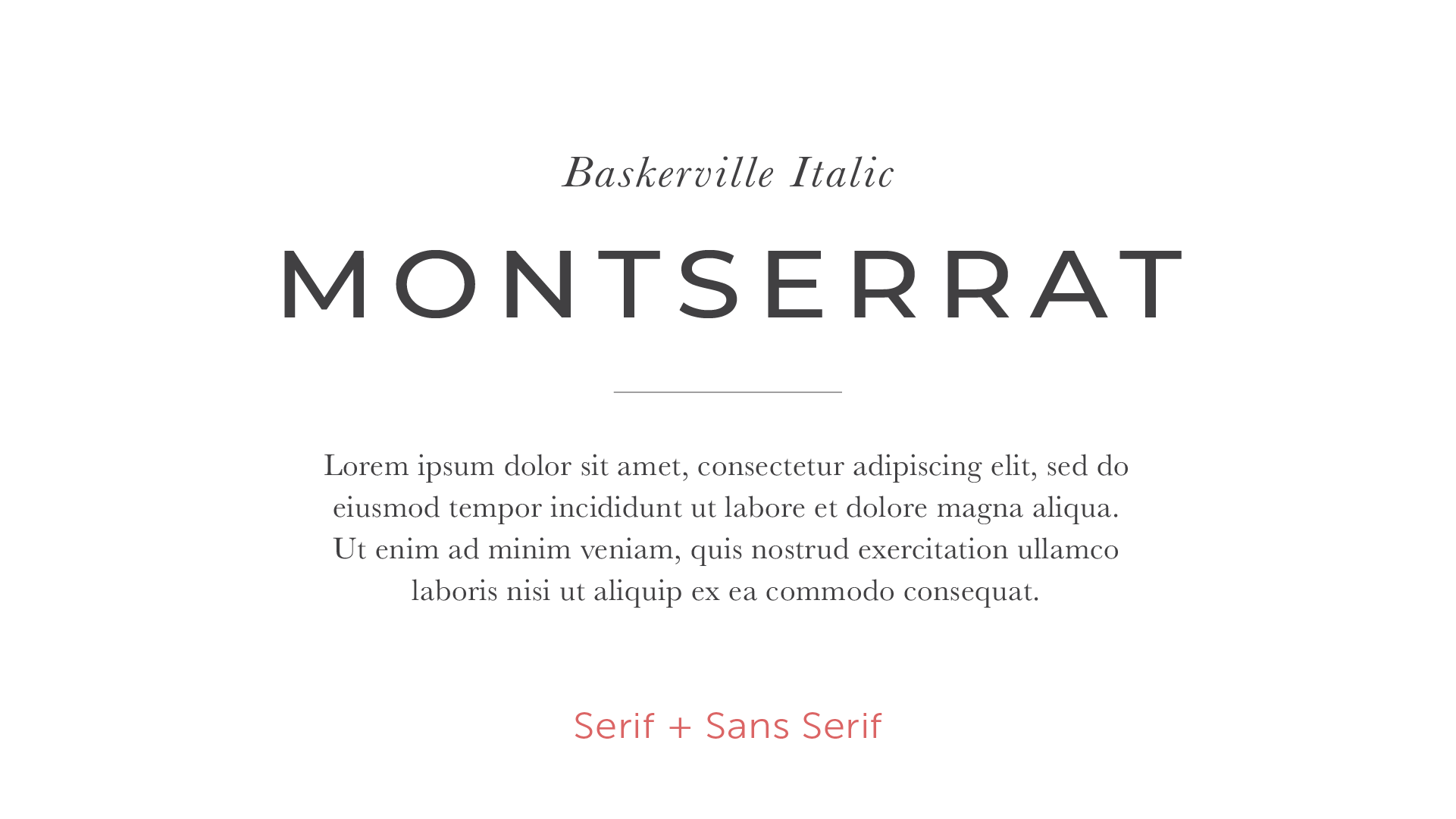
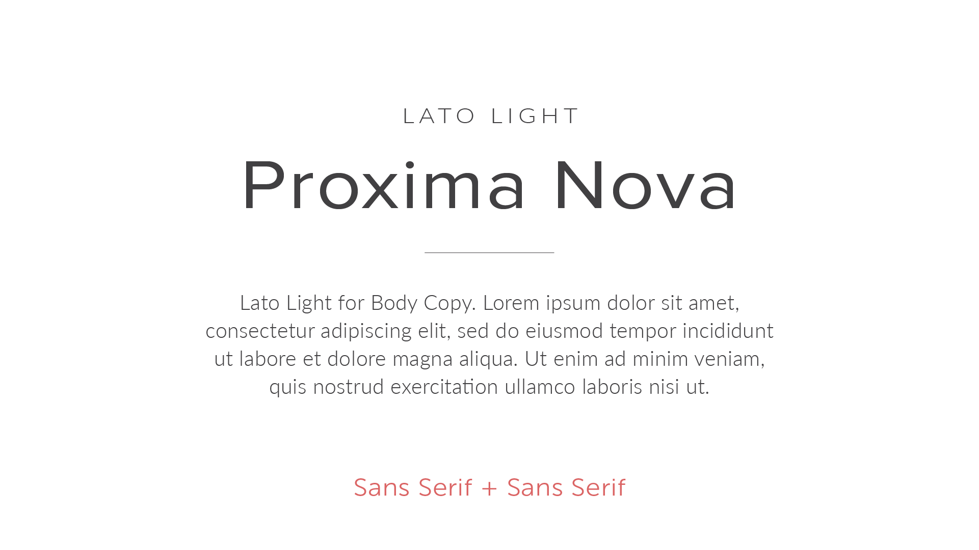
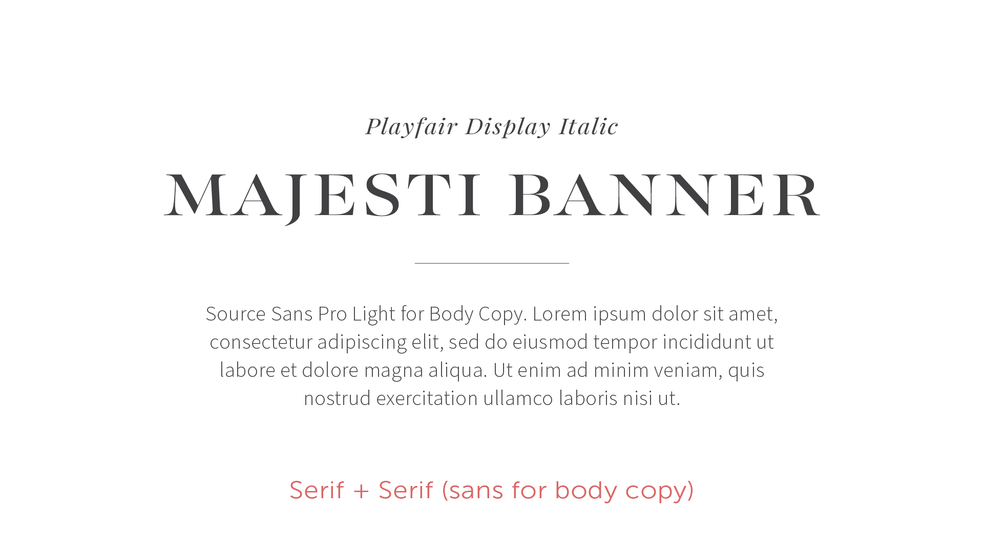
Method #2: COMBINE TWO FONT FAMILIES
Use different font families and ensure you’re creating some sort of contrast between them. Don’t choose more than 3 different fonts total (one for headers, one for subheads, one for body copy).
Serif + Sans Serif: A fool-proof combo, since it naturally has contrast.
Serif + Serif: A little trickier to create contrast without it getting too busy. I recommend using sans serif for body copy if both headers and subheads are serif fonts.
Sans Serif + Sans Serif: A clean and modern look. Be sure to create contrast with the style of the letters (bold, italic, etc.).
Examples of the above, using various fonts:
A few more Pro Typography Tips:
Be sure to bookmark these! These will help you make better (and more professional!) decisions as you select your fonts and elevate your marketing visuals using typography.
Tip #1:
Script, handwritten, and display fonts should be used selectively and only for individual words or short phrases (no more than 5-6 words). And if you do use one, don't mix and match... select one and one only!
Tip #2
Pay careful attention to your letter spacing + line spacing -- more space between your letters in your titles and increased line spacing in your paragraph copy will help with the readability, flow, and professionalism of your design.
Tip #3
Be aware of typographic alignment. Don't use justified alignment unless you have a compelling reason to, as it will add odd spaces between words and make body copy hard to read.
Some of my favorite resources to find and purchase fonts:
Note: Always read the fine print before downloading a font to ensure it truly is free for all uses. Some fonts are free for personal use but not commercial/business use. It’s up to you as the user to know the difference and make sure you’re using your fonts legally.
Free fonts:
Paid fonts:
Other fun font resources:
Type Wolf: Great for reading about typography trends and helpful when you’re trying to find a font that’s similar to another font (say when you like one but it’s outside your price range and you want to find a similar one).
Font Joy: Generates font pairings and allows you to save the ones you like!
Font Pair: Gives you Google (free) font combos specifically and you can choose by font combo type.
Want to GET EVEN MORE TYPOGRAPHY AND DESIGN TIPS?
Be sure to check out my Style Guide Workshop!
YOU MIGHT ALSO LOVE…


