
3 Ways to Engage Your Audience With Your Marketing Visuals Using the Basic Design Principles
If you’re a DIYer at heart and on a mission to improve the look of your marketing collateral and graphics (or if you’re improving your design skills so you can elevate the design work you do for your clients), you may have dipped to your toes into the design principles.
Using Alignment, Visual Hierarchy, Negative Space, and the other Principles of Design is game changing for helping you create beautiful marketing visuals that attract the eyes of your audience.
But that’s just the beginning. Learning these basic principles in your designs will help guide your audience to “do the thing” and take the next step you want them to take.
So, that is to say…
Using the Principles of Design in your marketing collateral and graphics can ultimately help you reach your business goals!
YES, design CAN BE THAT IMPACTFUL!
If you’ve never heard of the Principles of Design and or need a refresher, check out this blog post for a great overview first!
Then come back to this post, because this is where we start digging into the “how” — how you use these design principles in your marketing designs and how they can help you engage with your audience (and look good doing it).
3 Ways to ENGAGE Your Audience with your marketing visuals
Using the basic Design Principles
1. Tell your audience where to look + what to do.
Whenever you sit down to create a marketing graphic or piece of collateral, it’s important to first get clear on your goal for the design and your call to action. From there, make design decisions and lay out your design in a way that supports that goal. A big part of this is to visually tell your audience where to look in your design and what to do, and doing so in a clear and engaging way.
Two Design Principles that will help you accomplish this:
Hierarchy + Emphasis
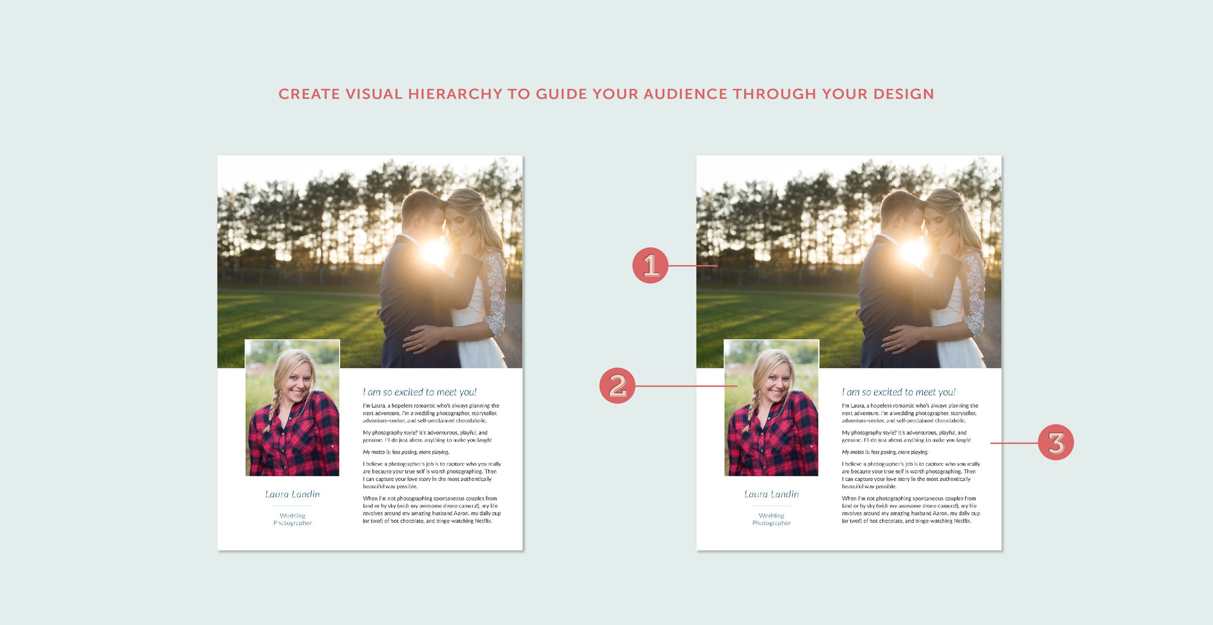
Creating a visual hierarchy in your designs will help you strategically guide your audience through your design, helping them focus on your core message and clearly understand the action you want them to take.
First, decide on your “point(s) of emphasis.” This should be the most important thing in your design — what you want to highlight and what you want your audience to see first.
Then rank all other elements that will be included in your design in order of importance.
Next, it’s time to design! Draw attention to your point of emphasis using size, color, shape, and/or font choice.
Then create a visual hierarchy with your other elements in similar or different ways, always ensuring they aren’t too distracting and taking the attention away from the point of emphasis.
Negative Space
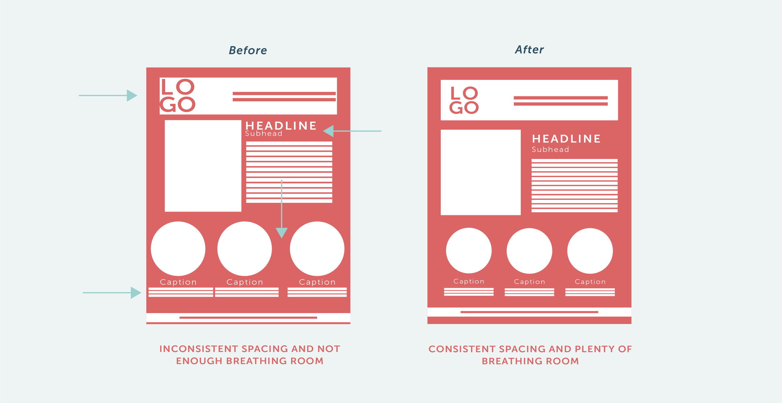
Using negative space (or “white space”) effectively will give your design room to breathe, making it more pleasing to the eye. It will also help support your points of emphasis and ensure your audience looks where you want them to look.
Try adding more space around your point of emphasis in your designs. Although it may initially feel counter-intuitive, this extra space will actually help draw the eye to your core message!
Also add space around and in between design elements and groups of content in your design. This will avoid text and elements running together (which will confuse your audience) and will ensure your audience stays focused on the right information, so they can easily take action.
2. Organize your design to make your message clear.
Thoughtfully organizing your design will help your audience digest the information in a logical way and ensures your message is clearly communicated (and not getting lost among the other elements in your design). A well-organized design also helps avoid visual overwhelm for your audience, and instead helps you keep their attention and there will be a better chance they’ll engage with you!
Two Design Principles that will help you accomplish this:
Grouping
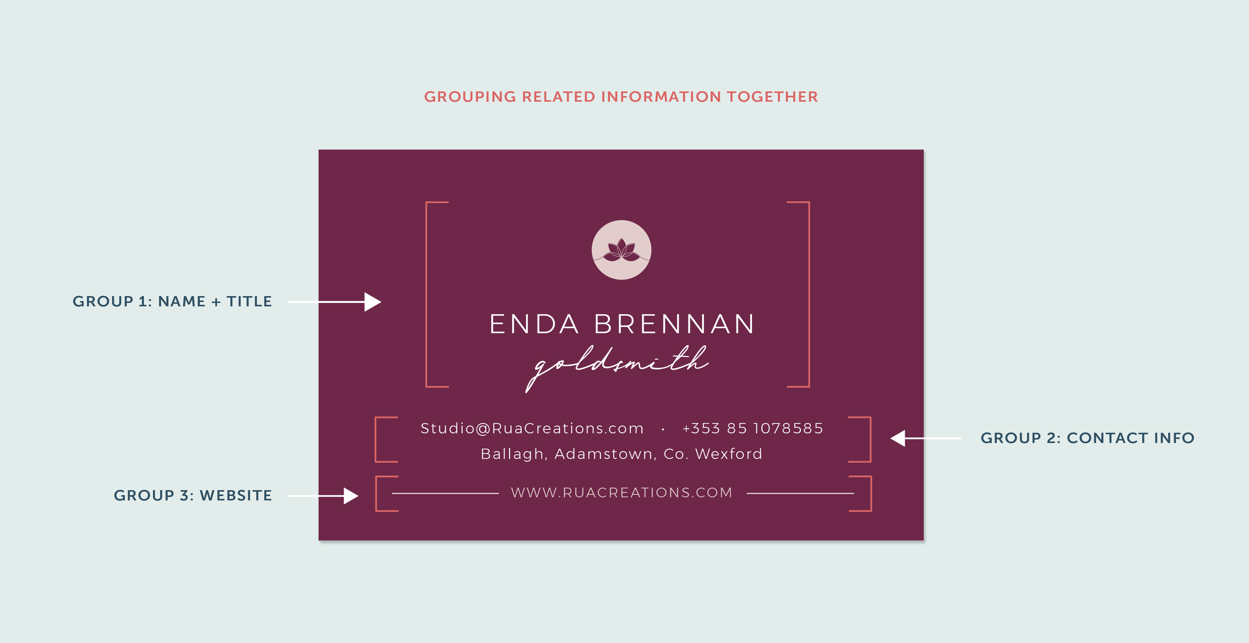
Grouping related information and/or elements together brings order to your design in a way that comes naturally to us as humans (especially humans who are constantly being bombarded with marketing messages!). It will also help make your designs more pleasing to the eye, *because* it will be easier for the reader to understand the message you’re trying to communicate.
First, think about what text or elements go together logically. What pieces of information seem to go together and should be processed by your audience at the same time?
Then, place related information and objects close to one another in your design, in relation to other objects.
A big part of this is paying attention to the space between the groupings too. If they’re too close together, things may start to blend together and there won’t be as much of a distinction between them.
Alignment + Margins
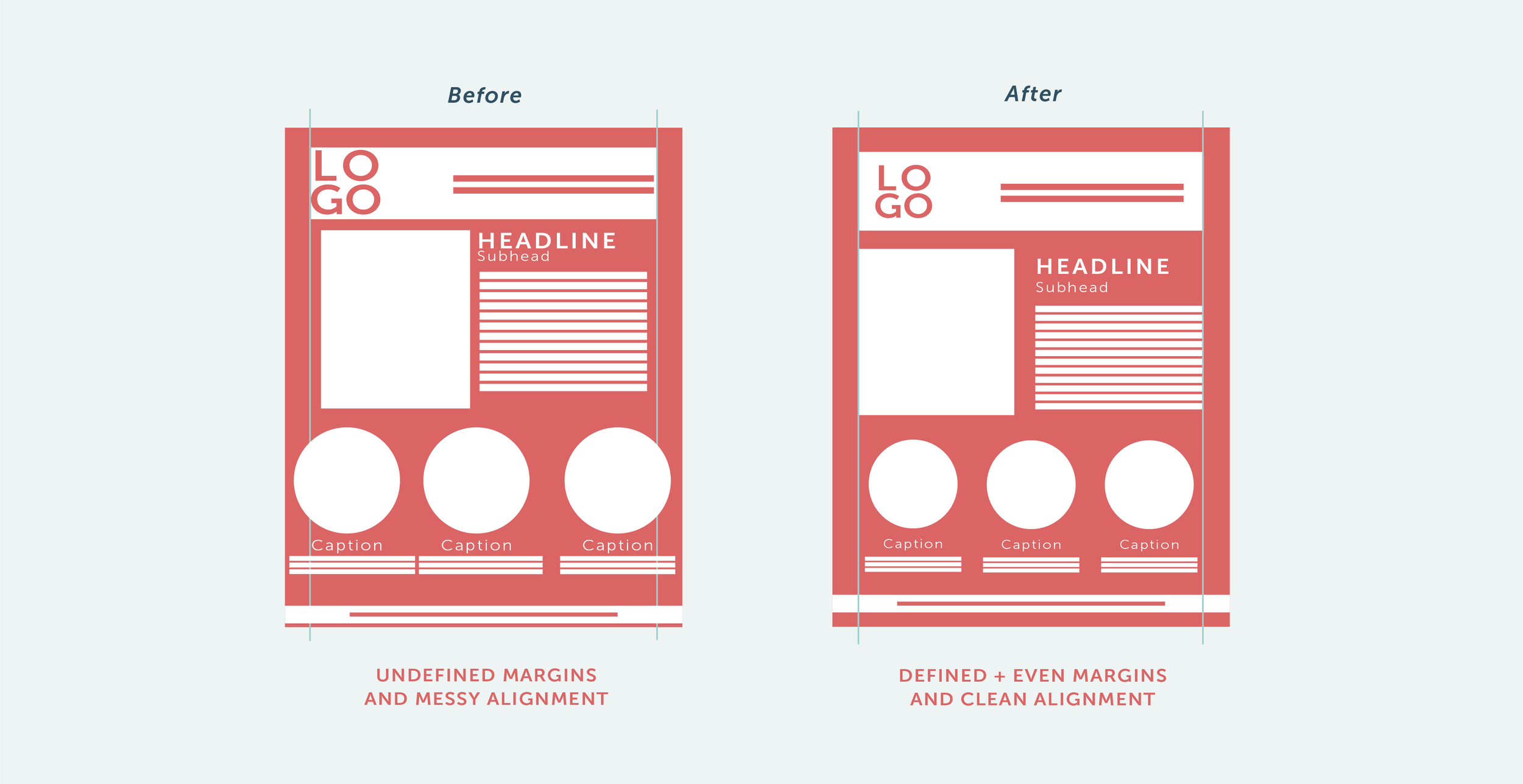
Good alignment and clean margins can do WONDERS when organizing information in your designs and ensuring your content feels easy to read and engage with. It will immediately help increase the professionalism of your designs too… which will naturally attract the eyes of your audience and build trust with them.
In every design you create, make sure there are clean and even margins around the outside your design (top, bottom, left, and right).
Then place your photos, text, and other design elements so that their edges align (either flush left, right, or even top and bottom of your layout, depending on the design). This will help you define the margins for your design and give it organization and structure.
You can also use center alignment for text and logos, or use more than one type of alignment in your design, called “mix alignment”. This can bring bring a bit more interest and dimension to your design… as long as it’s done well and intentionally, and your design’s organization stays intact.
3. Be visually cohesive throughout your marketing.
Being cohesive across all your marketing platforms is SO important for brand recognition, which leads to trust and your audience investing in you. Although your visual branding (i.e. your logos and marks, color palette, font selections) play a big role in this, it isn’t the only way you can be consistent with your visual marketing.
Two Design Principles that will help you accomplish this:
REPETITION + SIMILARITY
Repetition is about using elements that have similar characteristics to create consistency within your designs, leading to a cohesive aesthetic. When there is a lack of similarity between elements, your designs will feel disjointed and won’t communicate as clearly as you want.
Here are some key tips for creating repetition and similarity in your marketing designs:
Within a single marketing collateral or graphic, design elements with similar characteristics or with a similar importance (see #1 above!) could be the same size, color or shape.
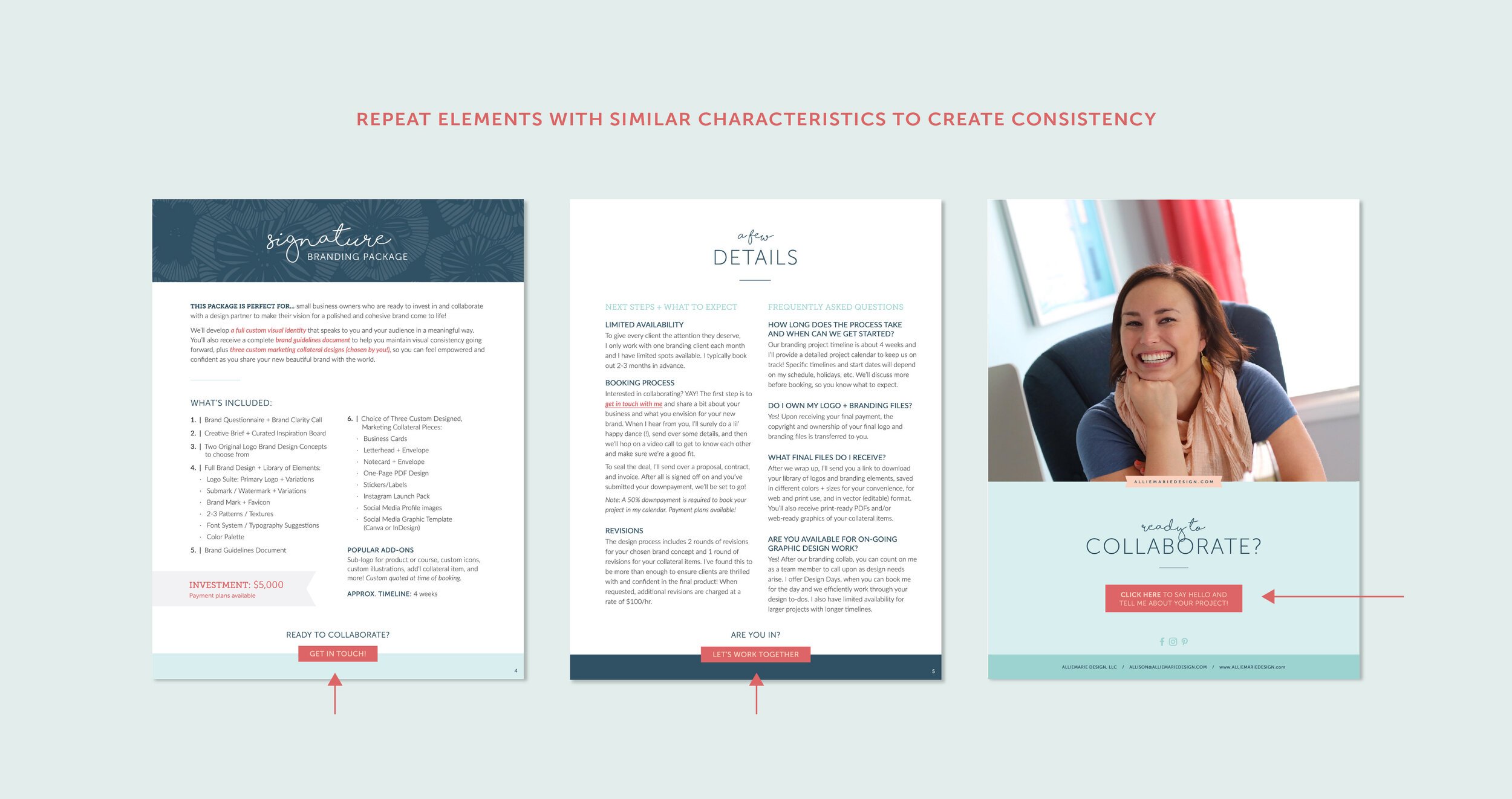
If you’re creating a multiple page design, being consistent with the placement of elements from page to page will give your design a nice cohesiveness. For example, in a report you could have your contact info at the bottom of each page or in a services guide, the layout of each of your package pages could be the same.
Using a defined color palette and font system across all your marketing will give your designs a cohesive and intentional look. PRO TIP: For color, choose 2 dominant colors used most often and 1 accent color used to bring attention to your call to action. For fonts, select one font for headers, one for sub-headers, and one for paragraph/body copy.
UNITY + VARIETY
We always want to create unified designs —a design that feels balanced, clearly communicates our message, and is engaging to look at. Adding some variety to a design will help us achieve more visual interest and avoid the design looking monotonous and boring. However, if a design has too much variety and no unity, the design will look unorganized, messy, and hard to digest.
The first step to achieving this blend of unity and variety (both in individual designs and across your marketing) is to decide which elements will be responsible for unifying your marketing designs and 1-2 things you’ll swap out for variety. There are endless ways to create this blend and how you do this will change depending on the nature of your individual designs, branding, and marketing as a whole.
A few examples, to get your wheels spinning:
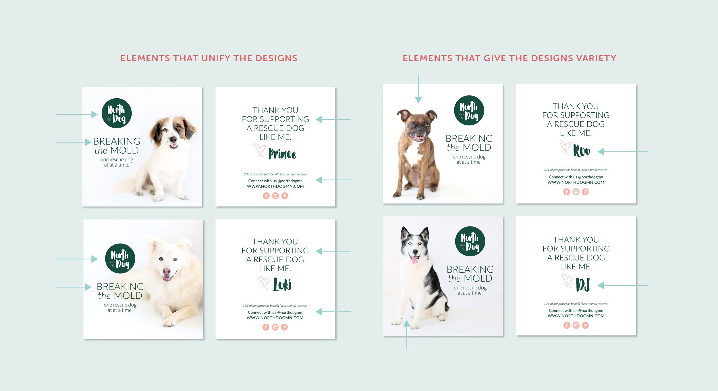
Create a set of 2-4 different social media graphic templates that you rotate through. All three of them should be on brand using your branding color palette, fonts, and logos/marks (creating unity) but unique in layout and content (creating variety).
On a packages + pricing sheet, lay out your packages in columns with all text justified to the left (creating unity). Then have the next steps / call to action button centered at the bottom (creating variety, and highlighting your CTA!).
When laying out a team page on your website, create a grid layout with all headshots on the left and bios on the right as you scroll. The layout will be consistent (creating unity) while the different headshot photos and names will be different (creating variety).
Want to learn more about the Principles of Design, to help you connect to your audience and reach your marketing goals?
MY DESIGN SPIRIT COURSE is for you!
I created my self-paced online graphic design course, Design Spirit to connect you with the right tools, knowledge, and exercises to design professional marketing collateral that you’re proud of AND that speaks to your audience.
We’ll cover planning for your design with intention, the Principles of Design + Composition, and creating an efficient design process for yourself. Plus we’ll go even more in depth with how to be cohesive and consistent in your marketing, including color theory and typography lessons!
YOU MIGHT ALSO LOVE…


