
Getting Started with the Principles of Design + Quick Tips for Using Them to Create Professional Marketing Collateral that Attracts Your Audience
Did you know that there are a set of principles to follow that will help your marketing collateral and graphics look more professional and help you attract and connect with your audience?
They’re called the Principles of Design + Composition and they are absolutely key to creating effective designs and layouts.
Why are the design principles important?
They help you make better design decisions and create well-composed designs, which will naturally look more professional and attract more people (as humans, we’re drawn to beautiful things!).
They help your designs look intentional, as opposed to disconnected (like you made arbitrary decisions) which can devalue and discredit what you’re trying to communicate.
They help you connect with your audience and strategically encourage them to do what you want them to do. Whether that’s contacting you about working together, purchasing something from you, clicking through to your website to read your blog post, or whatever your “call to action” might be. Read this blog post for an in-depth look at how setting goals and intentions for your design can set you up for success.
Want your Instagram feed and graphics to have a cohesive look?
The Design Principles can help you create that.
Need a go-to presentation / slide deck template that looks professional and consistent with your brand?
The Design Principles can help you create that.
Craving a refresh to your service guide or brochure, so it looks more inviting and less text-heavy?
The Design Principles can help you create that.
In this post, I’ll give you an overview of the Principles of Design + Composition, plus some quick tips on getting started using them in your designs right away!
Let’s dive in!
THE PRINCIPLES OF DESIGN + COMPOSITION
Pin for later!
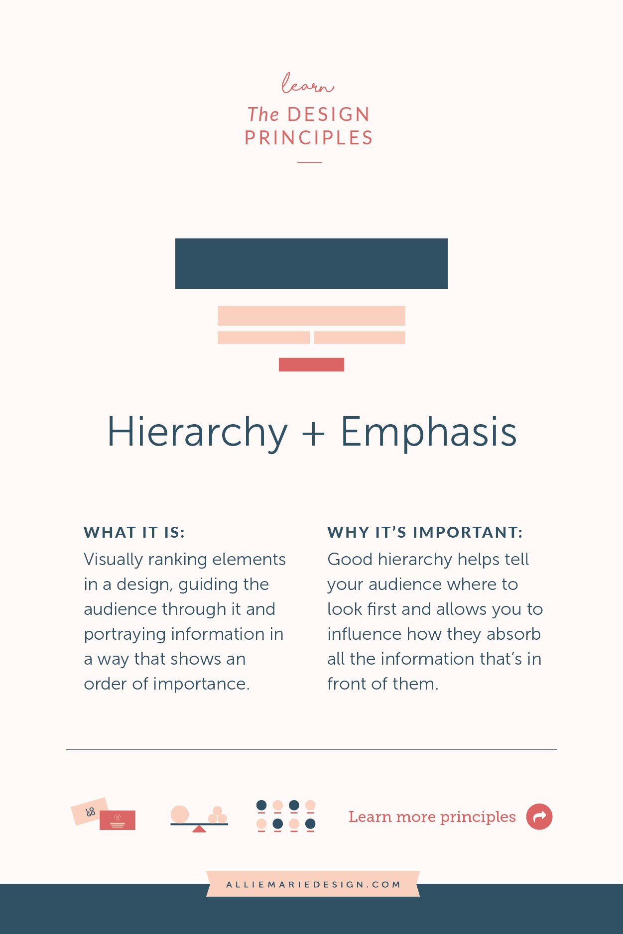
Hierarchy + Emphasis
Visually ranking elements in a design, guiding your audience through the design and portraying information in a way that shows an order of importance. Good hierarchy helps tell your audience where to look first and then allows you to influence how they take in the information that’s in front of them.
QUICK TIP! How to start using this design principle:
Before starting to design, determine your point of emphasis — the thing that’s most important and/or what you want your audience to see first. Then rank all other elements and content in order of importance. This way, you’ll know exactly what to highlight the most and how you can create your visual hierarchy.
Pin for later!
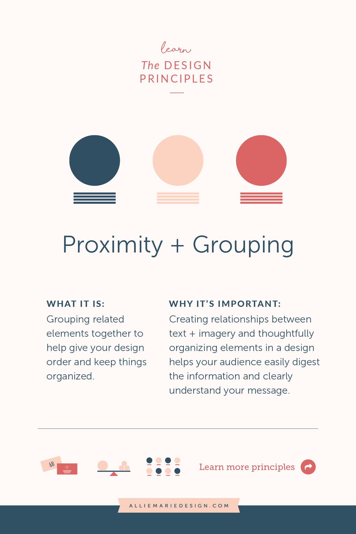
Proximity + Grouping
Grouping related elements/copy together to help give your design order and keep things organized. Creating relationships between text + imagery and organizing information in a design in a thoughtful way helps your audience digest the information in an orderly way.
QUICK TIP! How to start using this design principle:
When you begin to design, think about what text and elements go together logically. Then place related information and objects close to one another in your design. Also pay attention to the space between these groupings, to make sure they’re visually separate enough and your audience’s eye won’t be darting all over the place!
Pin for later!
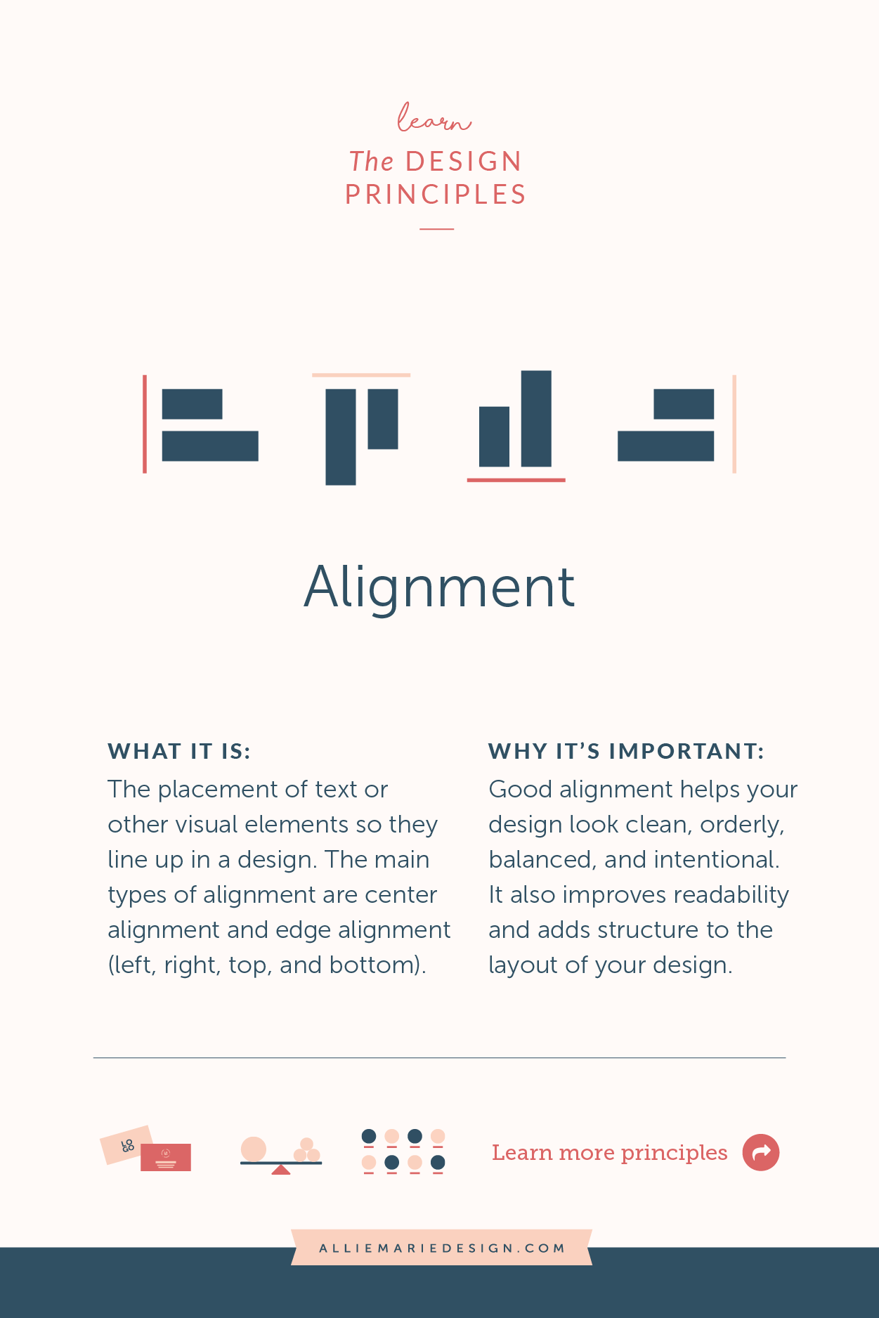
Alignment
The placement of text or other visual elements so they line up in a composition. Having good alignment helps your design look more orderly, organized, balanced, and intentional… not to mention more professional! It also improves readability and adds structure to your design.
QUICK TIP! How to start using this design principle:
Simply put, make sure all the elements in your design line up in an intentional and orderly way. You can do this using edge alignment where your elements are all aligned on the vertical axis (left or right aligned) or horizontal axis (top or bottom, or you can use center alignment. And don’t forget about your margins — ensure they’re consistent around the outside of your design.
Pin for later!
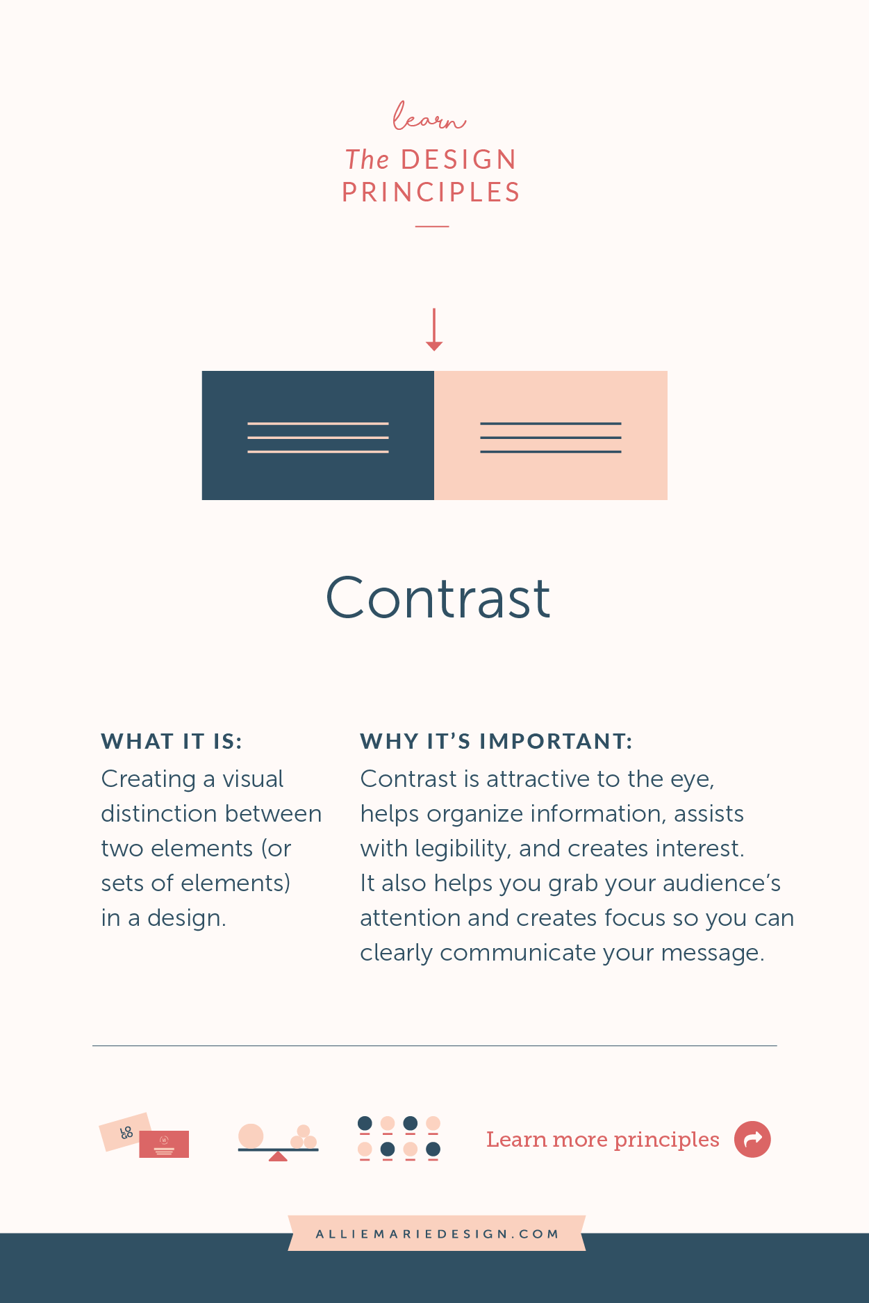
Contrast
Creating a visual distinction between two elements (or sets of elements). Contrast is attractive to the eye, helps organize information, helps with legibility, and creates interest within a design. It also helps you grab your audience’s attention and creates focus so you can clearly communicate your message.
QUICK TIP! How to start using this design principle:
You can create contrast in a number of ways… color, size, typography/fonts, shape, texture/pattern, and more. When you sit down to design, decide what to add contrast to and make sure it’s noticeable. But don’t add contrast to everything, as your design will lack balance and focus!
Pin for later!
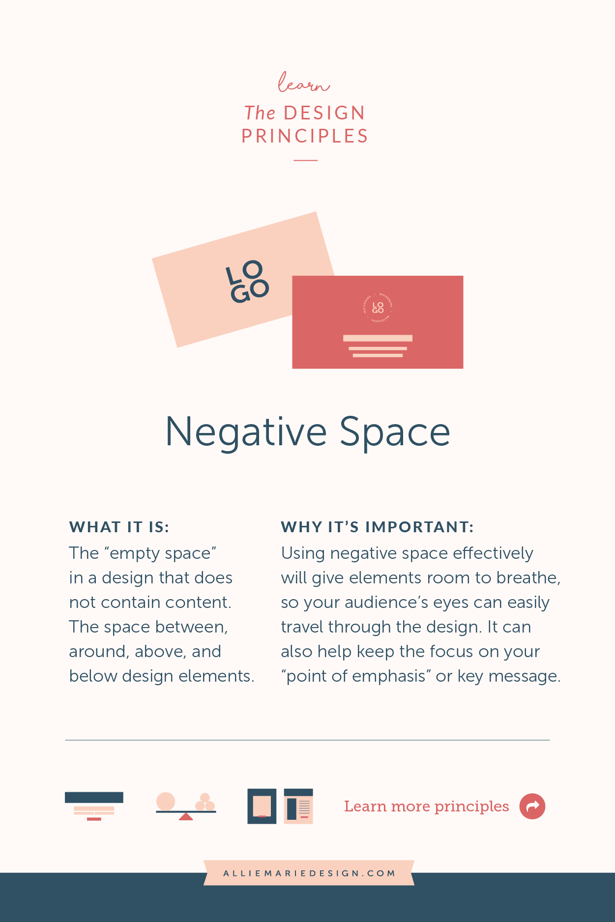
Negative Space
The “empty space” in a design that does not contain content, or the space between, around, above, or below design elements (also referred to as “white space” but it doesn’t need to be white). Using negative space effectively will give elements in your design room to breathe and will help keep the focus on your “point of emphasis” or message.
QUICK TIP! How to start using this design principle:
Ensure there’s always plenty of space around and in between elements and grouped elements so they eye can easily travel through the design. Try adding more negative space around your points of emphasis — this will draw the eye to them!
Pin for later!
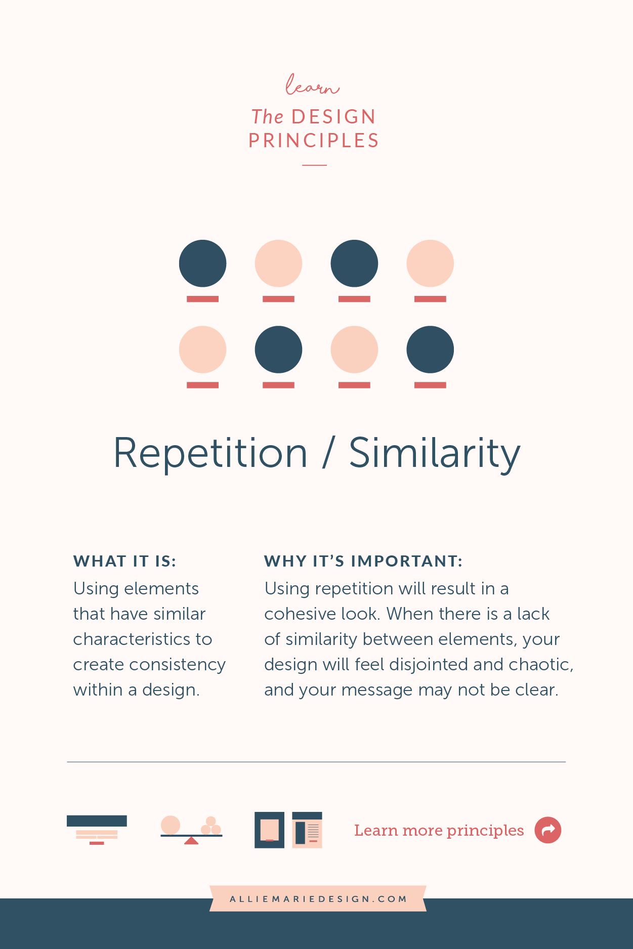
Repetition / Similarity
Using elements that have similar characteristics to create consistency within a design. What will result is a cohesive look — if you’re strategic about your choices, you’ll be on-brand too! When there is a lack of similarity between elements, the design will feel disjointed and chaotic, and your message may not be clear.
QUICK TIP! How to start using this design principle:
When you first start to lay out a design, decide which parts/elements will remain consistent throughout the design and will help bring things together. For example, you can do this by making all your headings the same text size, font and color or placing your calls to action in the same rectangular box a the bottom of the page.
Pin for later!
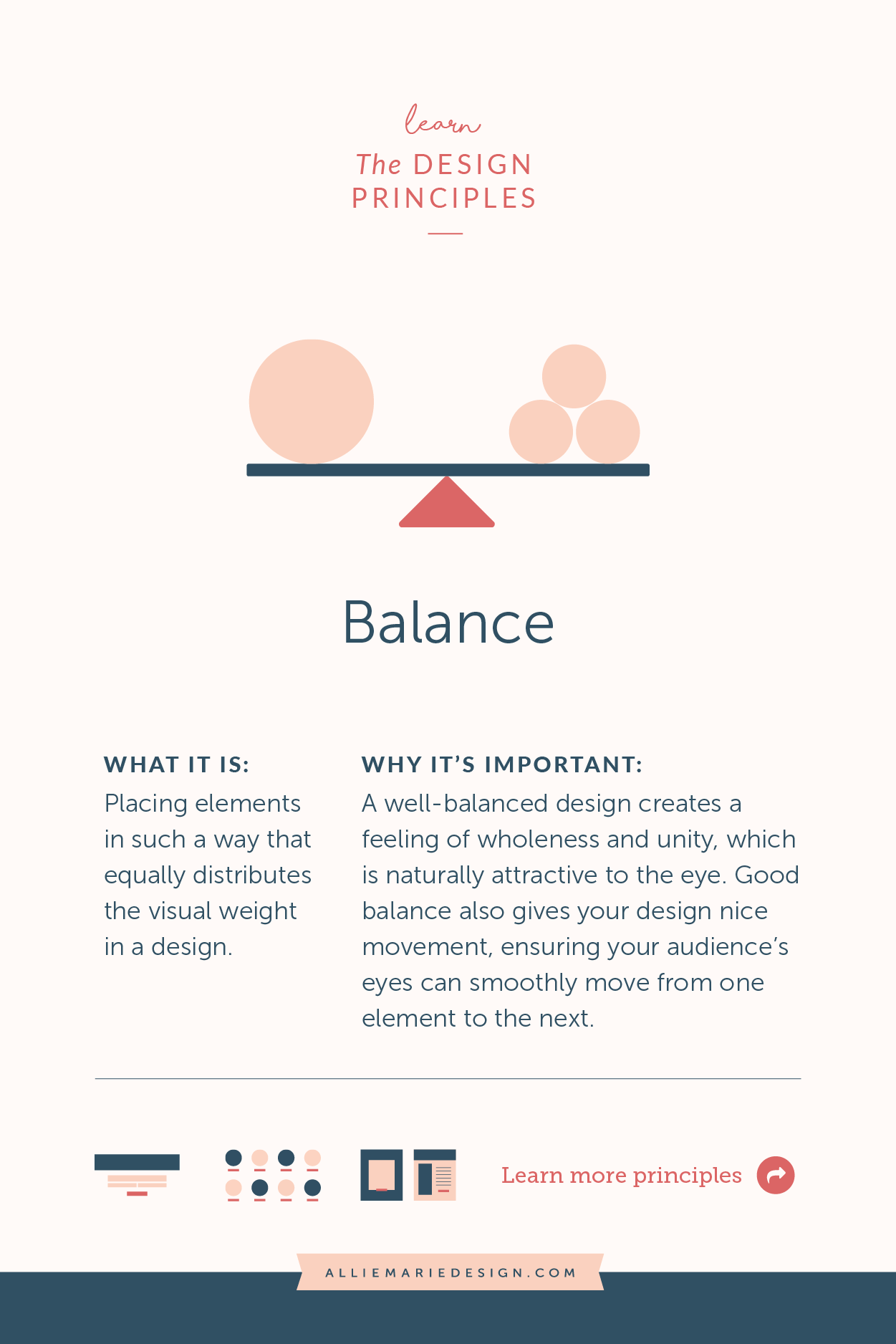
Balance
Placing elements in a way that distributes the visual weight equally in the design and ensures the viewer’s eye easily moves from one element to the next. When you step back from your design, there should be a feeling of wholeness, while an unbalanced design won’t feel right (when you look at it, it may give you a sense of tension or an unsettled feeling — it won’t feel unified).
QUICK TIP! How to start using this design principle:
Think about when you first move into a new home and you’re setting up your bedroom -- you wouldn’t place all your furniture in one corner of a room, right? Same with a design composition. You don’t want to crowd all your heavy elements in one area of the design, rather you want to evenly distribute the visual weight so there’s nice flow and movement. This will help you create a balanced design!
Pin for later!
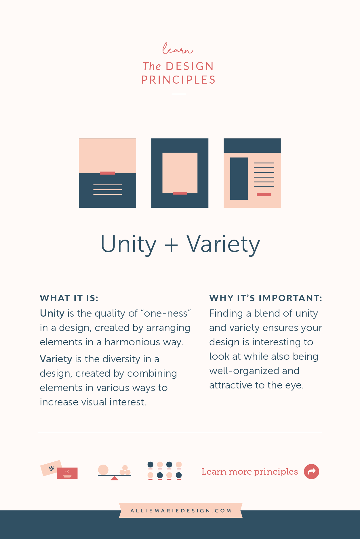
Unity + Variety
Unity is the quality of wholeness or “oneness” in a design, created by arranging elements in a harmonious way. Variety involves creating diversity in a design by combining elements in various ways to increase visual interest. Finding a blend of these two ensures your design is interesting to look at while also being well-organized and easy on the eyes.
QUICK TIP! How to start using this design principle:
How do you achieve a blend of unity and variety? By leaning on the design principles :) To get started… to create UNITY, I recommend using proximity/grouping, alignment, balance, negative space and repetition/similarity. Use hierarchy and contrast to create VARIETY, adding interest and perhaps unexpected elements to your design.
Want to dive in further?
Looking to learn more about using these principles, see lots of visual examples, and receive guidance on how to design more professional marketing collateral and graphics?
My Design Spirit course was created for you!
👇👇👇

Design Spirit
I created my self-paced online graphic design course, Design Spirit to help you develop a better design eye, brush up on your layout skills, and connect you with the right tools, knowledge, and exercises to design like the professionals do.
Inside the course, you’ll learn how to:
Plan and set goals for your design
Expertly use the Principles of Design + Composition
Have a cohesive and consistent look across the board in your marketing (including lessons in color theory and font selection)
Develop a solid design process for yourself, with an inside look at mine + a cheatsheet!
Get organized with a design file organization system, so you can be more efficient.
You’ll also receive design templates galore and exclusive access to a private Facebook group where you can ask questions and get feedback as you go through the course.
YOU MIGHT ALSO LOVE…


