
6 Tips for Creating a Cohesive Look Across All Your Marketing Platforms, to Help You Build Brand Recognition and Gain Your Audience's Trust
When it comes to your marketing visuals, an intentional and uniform vibe throughout all platforms and client/customer touch-points is an absolute MUST. From your website to your social media, from your business card to your email marketing, everything should look and feel consistent.
Why is this important? Because…
Having cohesive + COnsistent visual marketing helps you…
1.) Build brand recognition
If you’re consistently incorporating the same design elements and have a cohesive vibe across all your visuals, things like an established logo, color palette, typography/font choice, photography style, etc. will start to feel familiar to your audience upon first glance and trigger something in their brain that says, “Oh, this is from (insert your name here)! Let’s check this out!”. Before they even read or process your message!
2.) Evoke a sense of confidence, professionalism and credibility in the eyes of your audience.
A lack of consistency and cohesiveness will make your marketing visuals look unintentional and can confuse your audience, which leads to a lack of trust and credibility. Instead, you want to instill confidence in your audience with professional looking graphics that give off the impression that you care, your are thorough, you’re the real deal.
Bottom line, cohesive and consistent visual marketing will help you be memorable and help you gain trust and loyalty with your audience.
How do you achieve cohesive visual marketing?
Start by breaking down the different branding and design elements that you use in your marketing visuals and ensure that you’re using them consistently and in a way that creates cohesiveness and uniformity in your marketing designs.
In this post, I’ll give you some actionable tips that will help you make effective changes in your marketing visuals and ensure you’re putting your best foot forward with a cohesive and consistent look across all your platforms.
here we go!
5 tips for creating a cohesive look in your marketing
Pin for later!
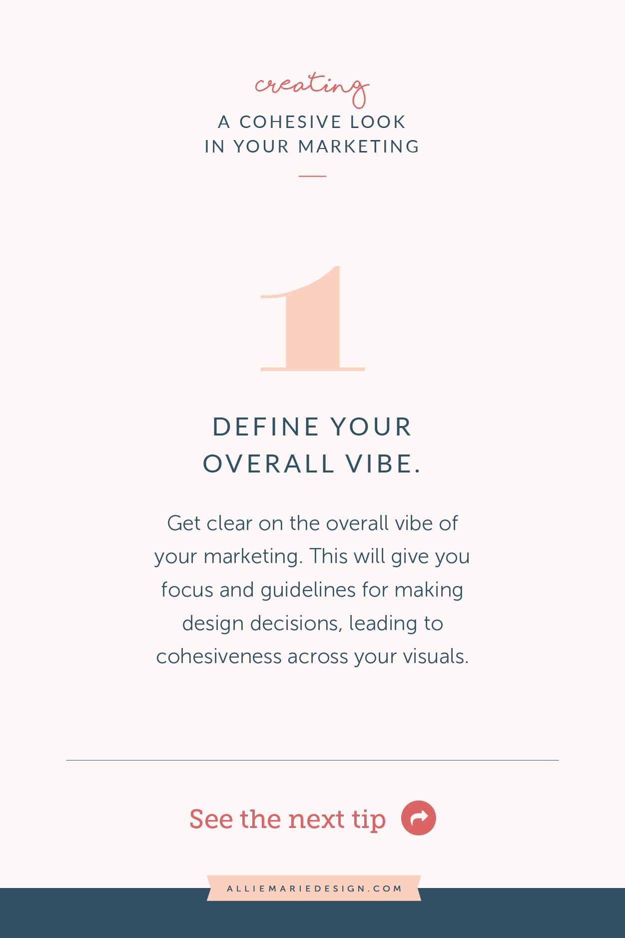
1.) Define your overall vibe.
Knowing what design style you’re going for is the first step to creating a cohesive vibe. Defining this will help you make design decisions that will naturally feel cohesive + consistent AND create graphics that feel like you and attract your audience, too!
How do you decide on an overall vibe?
Here are two fun exercises to get you started:
Take my design style quiz!
My quiz will give you a great starting point as you figure out what style you’re naturally attracted to. You’ll also receive personalized and actionable tips on how to enhance your design personality in your marketing. Take the quiz!Create an Inspiration Board
Create a new board on Pinterest and collect any imagery (photos, graphics, etc.) that catch your eye as something that aligns with the style and personality you’re trying to communicate in your marketing. Then step back, identify the visual consistencies, and remove anything that don’t seem to quite fit with the rest. There shouldn’t be anything that doesn’t align with the style you’re going for (even if you like it… it needs to fit the overall vibe). What you’ll be left with is a curated board that has a cohesive visual look!
Use the results from the above exercises as a guide for all your marketing visuals. Whenever you start to design a new marketing piece, plan out your Instagram feed, or choose photography for your website, start by referencing your design style and curated inspo board. Everything you create should fit right in and feel like it belongs!
Pin for later!
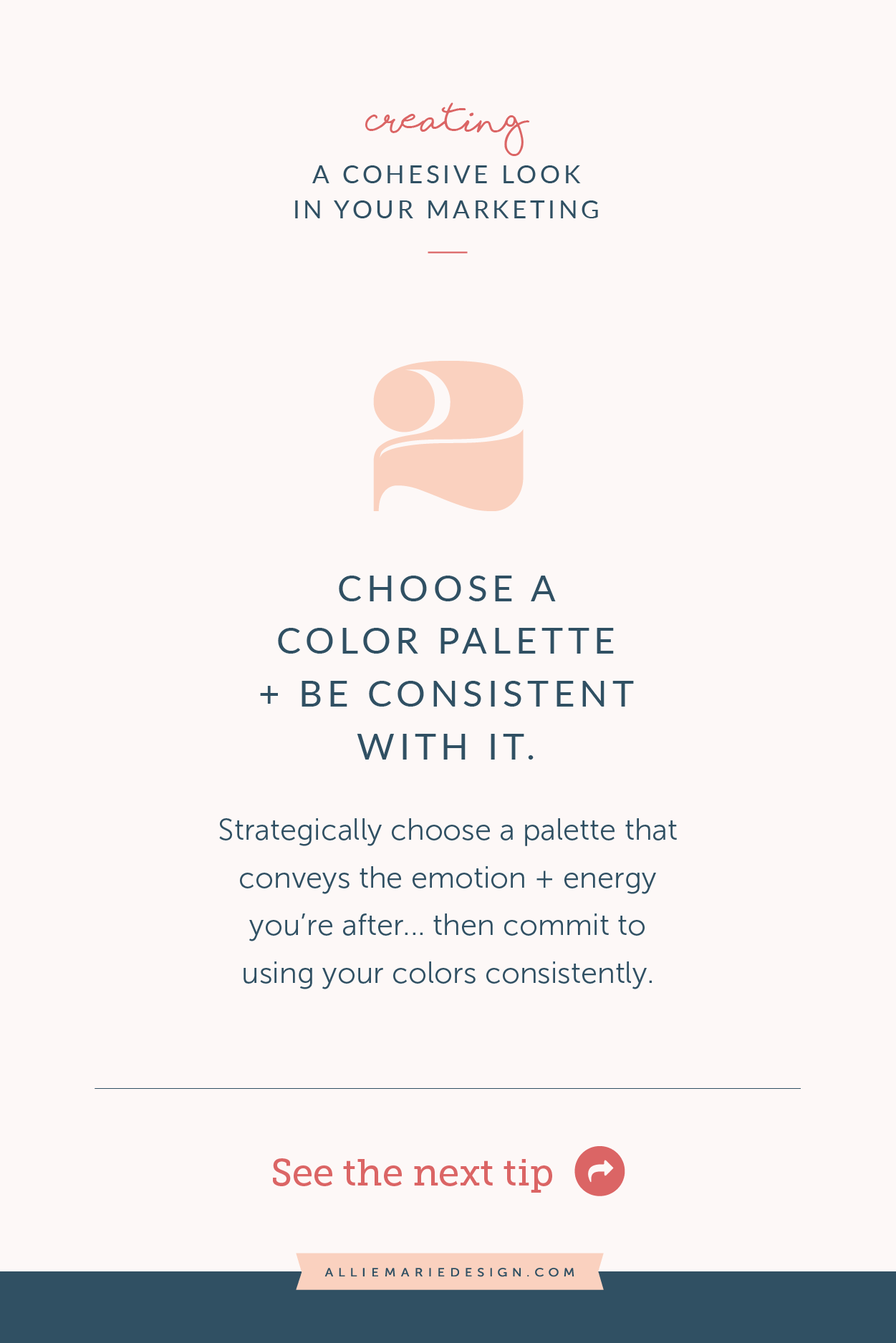
2.) Choose a color palette and stick with it.
When it comes to color (and a lot of things in design), there truly are endless possibilities and the design decisions you make depends heavily on your specific business, brand, goals, audience, etc. But I’m here to tell you that, above all, consistency is KEY. So I encourage and challenge you to yes, strategically choose a color palette but also be sure to use it in a consistent way.
pro tips for creating and using a color palette with COHESIVENESS + CONSISTENCY IN MIND:
Choose your color palette based on your audience and what feeling you want to evoke to them. Yes, I want you to love your color palette. But more importantly, it needs to resonate with your audience and make them feel the right emotion.
Consider starting with at least one dark color, one light color, and one accent color. Then explore adding a neutral and perhaps a couple shades or tints (depending on the energy you want it to have). This will create depth, balance, and the contrast you’ll need in your graphics and collateral.
Assign roles to each of your colors in your palette. Choose a dominant color (used most often and anchors everything in your design), a secondary color (compliments your dominant color), and an accent color (used minimally and for bringing attention to specific messaging or calls to action). All other colors can be considered supporting colors that appear here + there in your photos and graphics.
Looking for inspo or some help finding the perfect color scheme? Some of my favorite resources are Coolors, Canva, and My Color Space.
Pin for later!
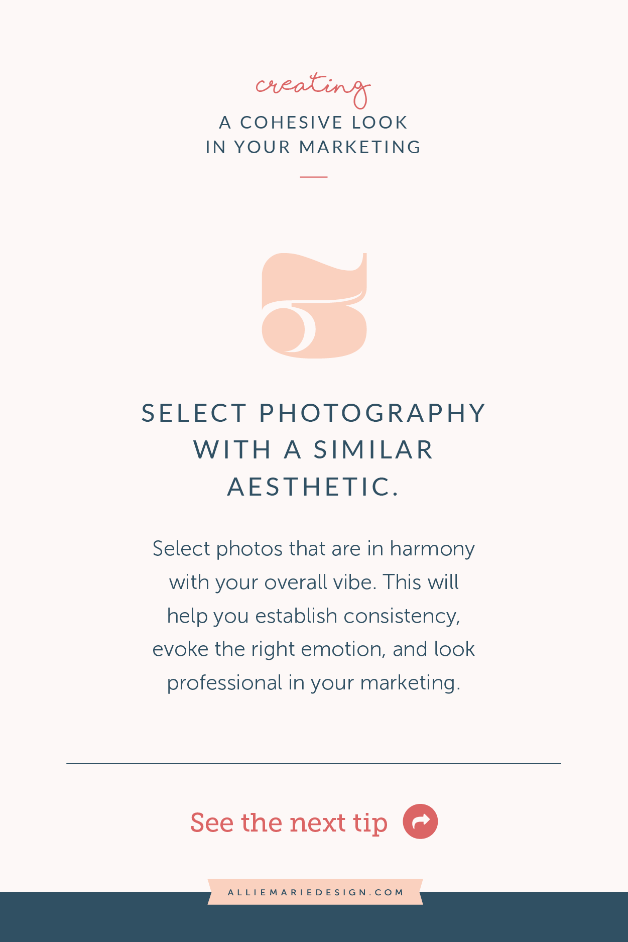
3.) Use photography + imagery with a similar aesthetic.
Selecting photos that are in harmony with your overall vibe is sooo important for consistency and appearing professional in your marketing. Using photos with a specific aesthetic across all your marketing platforms — from your website to your Instagram feed — will also play a big roll in gaining brand recognition!
pro tips for SELECTING PHOTOS with COHESIVENESS + CONSISTENCY IN MIND:
Remember that inspo board I talked about in #1? Use that as a guide when selecting photos and imagery!
Take your color palette into consideration. Select photos and imagery that incorporate hues that either match your color palette or compliment it.
Pay attention to lighting. Do you want your photos to be dim and moody? Light and airy? Bright and crisp? Choose a lighting aesthetic that aligns with your overall vibe and ensure all your photography has it (make sure this is represented in your Pinterest inspo board, so it can guide you!). To help maintain consistency with any photos you personally take, use the same settings or process when you edit them in Photoshop or the photo app on your phone.
Consider getting your own professional photos taken. Working with a professional photographer will help take the guess work out of curating photos and help you stand out in your marketing! Your photographer will work with you on creating a library of images that work well with your color palette, align with your overall vibe and message.
Remember, the most important thing is for your photos to have an aesthetic that’s consistent with the vibe you want to create.
Also, always be aware of copyright law and never use photos you don’t have permission to use! You can find great free stock photos on Unsplash and Pexels.
Pin for later!
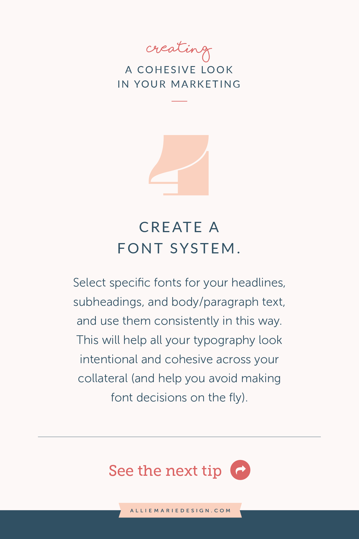
4.) Use a font system.
Just like your color palette, consistency is key when it comes to your font selections. That’s why I recommend creating a simple font system to follow and use throughout your marketing.
A font system essentially tells you what font you use for what purpose. This helps you avoid making font decisions every time you sit down to design (all those decisions are already made!). It will also help your graphics and communications pieces look cohesive, intentional, and memorable.
Pro tips for creating a font system with COHESIVENESS + CONSISTENCY IN MIND:
Assign roles to your fonts. Assign a font for your headers, then for your subheads, and finally for your body copy or paragraph text. You could also add one for callouts/accents/calls to action, if you wish and it’s a good fit for your marketing.
When you’re making your font selections, keep it simple. A fool-proof way to pair fonts and ensure consistency is to choose fonts within the same font family. If you’re mixing font families, stick to no more than 3 different fonts total.
A few of my favorite websites to download / purchase fonts: Google Fonts (of course), Creative Market, and MyFonts.
Pin for later!
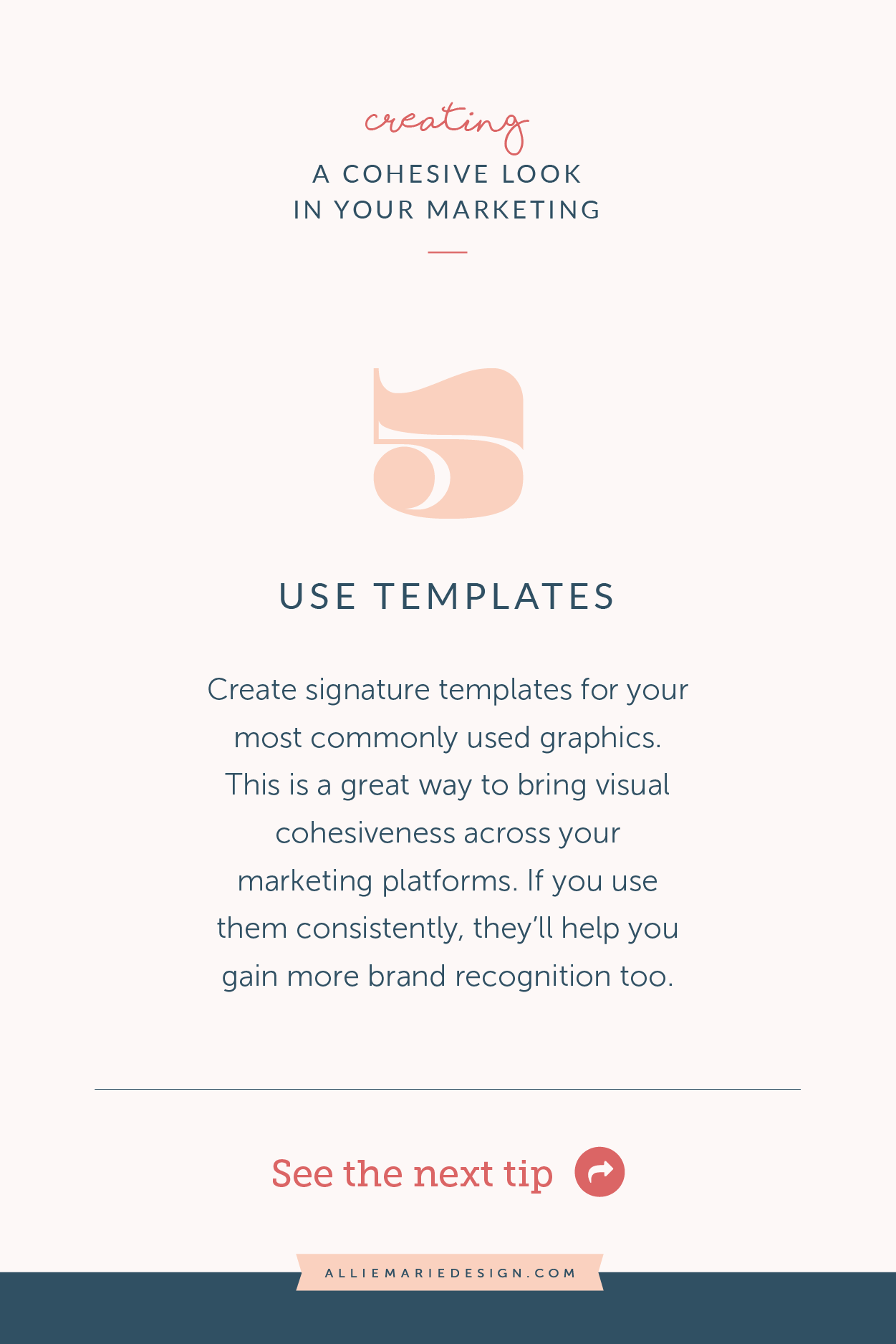
5.) Use recognizable + consistent graphic templates
Having signature layouts / templates for your most commonly used graphics is a great way to bring visual cohesiveness across your marketing platforms. You will naturally start to gain more brand recognition based on those layouts, too!
Creating templates is an easy way to create visual guidelines for yourself, which will result in you being more cohesive.
Pro tips for creating templates with COHESIVENESS + CONSISTENCY IN MIND:
If you’re designing your own templates… make sure they have a blend of structure and flexibility. Think about the varying content that will need to be incorporated when you use them and take into consideration varying lengths of text, different types of imagery, etc. That way, you don’t have to make big changes to your layouts every time you use them (which will help with consistency).
If you’re using pre-designed templates, choose a few for different applications (a set of Instagram templates, lead magnet design, Pinterest blog post graphic, for example). Ensure they align with your vibe and don’t forget to update the with your color palette and fonts!
Whatever template designs you land on… stick. to. them. It may feel boring or repetitive to you, but it won’t feel that way to your audience. And the only way to gain brand recognition is to be consistent and give your audience a chance to start recognizing your graphics.
I have some template sets in my shop that are fully customizable and plug-and-play! Canva and Creative Market also have some really incredible options too.
Pin for later!
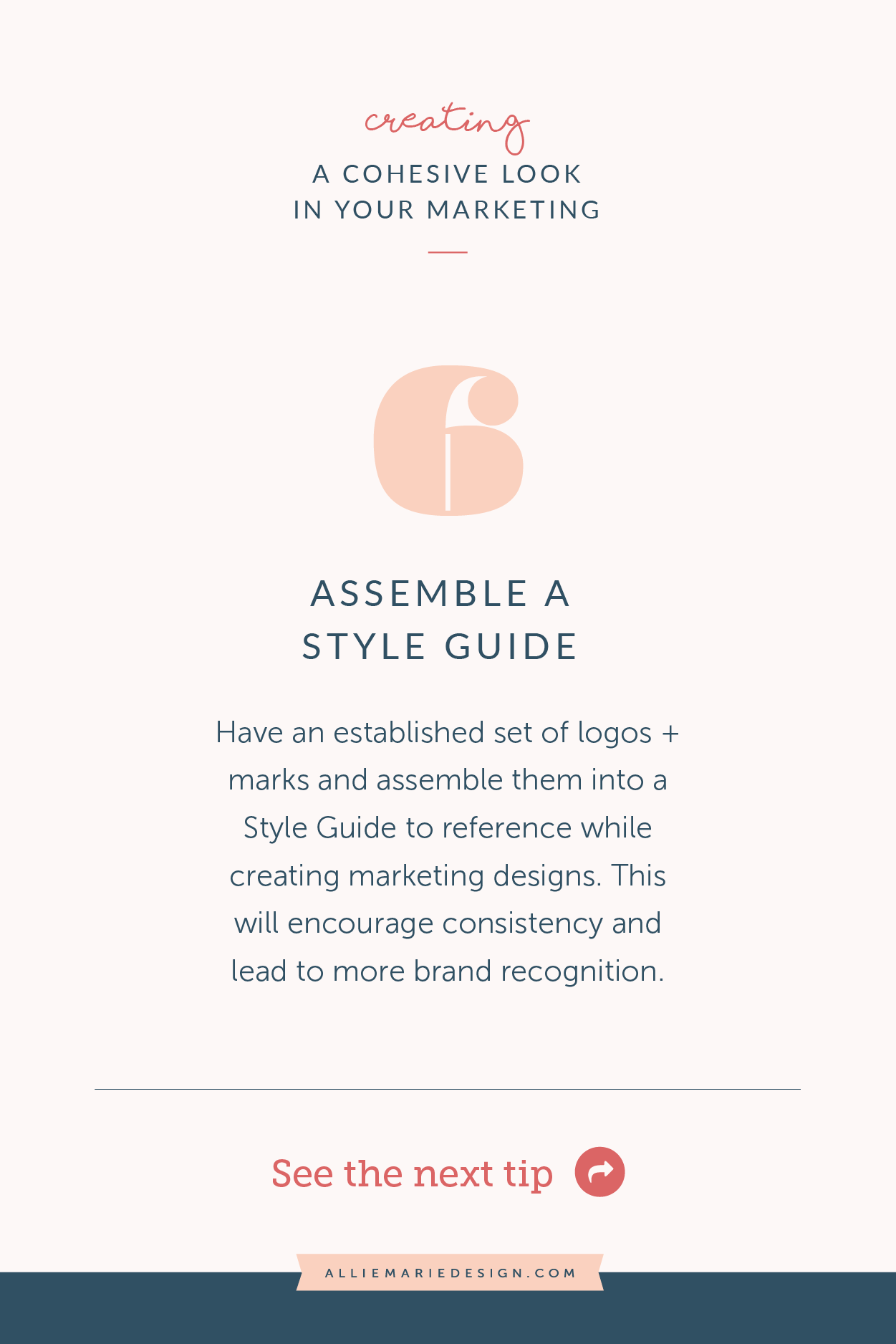
6. Have an established set of logos + symbols (and assemble a Style Guide!)
You’ll notice I haven’t said anything so far about logos or having a solid visual brand in place. That’s because I honestly believe that you can create a cohesive visual marketing WITHOUT that!
That being said, of course it is immensely helpful to have an established set of logos, marks, and symbols to represent your business and create a cohesiveness in your marketing that is memorable to your audience and conveys professionalism.
A great way to ensure you’re being consistent with these logos and marks?
CREATE A brand style guide!
A Style Guide is a document that lays out all your visual design elements that you use for your branding and marketing designs. It can look different from business to business, but it typically includes:
All your logos and key marks (logo, logo variations, watermark, etc.)
Any patterns, textures, and icons you use
Your color palette + color codes
Your font system
The purpose of a Style Guide it to have something to reference and refer back to every time you sit down to design a graphic or marketing collateral piece for your business. It’ll help you remain consistent with everything you create moving forward.
Create your Style Guide in any design program you wish! Check out my helpful Style Guide Workshop if you’re looking for guidance (and a template!).
Interested in learning more about creating a cohesive vibe and designing graphics that build brand recognition (and make you look professional)?
Check out my Design Spirit course!
I created my self-paced online graphic design course, Design Spirit to connect you with the right tools, knowledge, and exercises to design professional marketing collateral that you’re proud of AND that speaks to your audience.
We’ll cover planning for your design with intention, the Principles of Design + Composition, and creating an efficient design process for yourself. Plus we’ll go even more in depth with how to be cohesive and consistent in your marketing, including color theory and typography lessons!
YOU MIGHT ALSO LOVE…


