
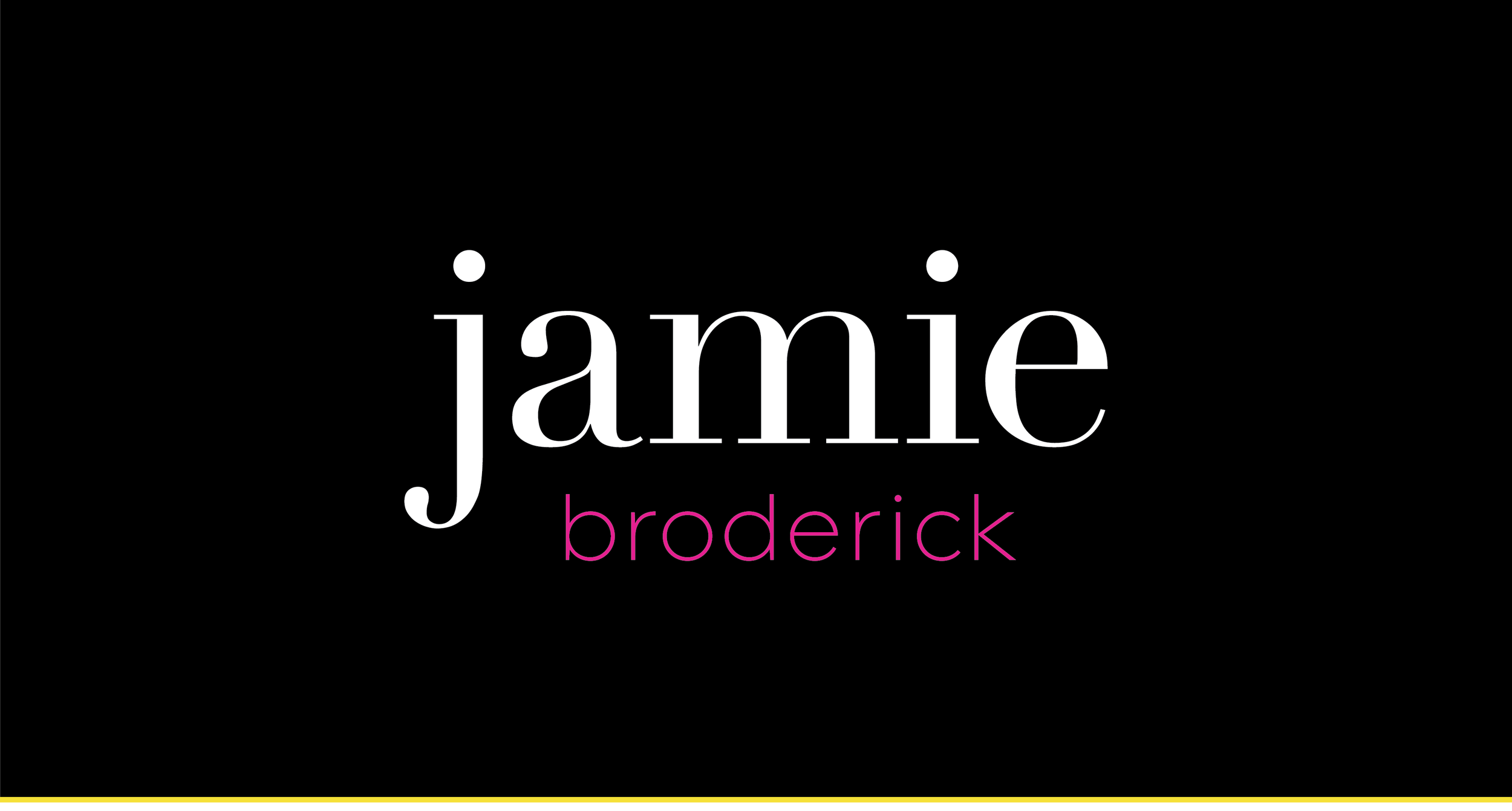
Brand Reveal: Jamie Broderick
Jamie Broderick is a visibility strategist who sets out to build community and inspire confidence in female entrepreneurs. She bridges the gap between the success they've already achieved and their potential for greatness.... helping them make connections with the right people who can help grow their business, establish themselves as market leaders with online visibility and leadership opportunities, and gain confidence to put themselves out in the world and make their dreams a reality.
Jamie does all of this through a personalized experience. She takes the time to really dig into each client's strengths and needs. She offers them personalized connections, introductions and coaching.
Talk about a rockstar!
Needless to say, she was already doing amazing things when Jamie came to me looking for a visual brand identity and website. In 2017, she felt it was time to uplevel and strengthen her online presence with a new jamiebroderick.com brand and website that offered her audience better opt-ins, streamlined blogs, and featured her digital programs. She was also developing her adventure retreat in New York state and her beach retreat in Florida! Jamie needed a hub for all these amazing resources, tools, and experiences she was creating for her clients and followers.
STEP 1: Brand Discovery + Inspiration Gathering
We kicked off our project with my brand discovery process (completing my branding workbo0k and gathering visual inspiration on Pinterest), which both helped me learn more about Jamie and her business -AND- helped Jamie clearly outline her mission and values, her big picture goals, what makes her stand apart from her competitors, who her ideal clients are and, of course, her style.
Her branding and positioning needed to attract female business owners, but specifically those who are willing and ready to invest. They are committed to showing up. They may have some level of success already, but they're craving more.
Jamie wanted her visual branding to feel energetic, fun and a little sassy, yet still professional and polished... a direct reflection of her personality and the experience she gives her clients. We went through two different mood boards and color palettes to pin down the look and feel she was looking for and the visual direction we would head. This is what we landed on... I'm still in love with it!

After we had a clear visual direction, we moved on to logo concept exploration and developing brand styling that would attract Jamie's ideal client and speak to her personality.
STEP 2: DESIGN + STYLING
We dove into the logo design process keeping in mind all of what we discovered in Step 1. A couple additional things that were top of mind:
The logo and marks should say "fun" and "relaxed sophisticated." They should have a nice balance of professional, confident and personable.
The logo and marks should somehow incorporate a script or handwritten font, something Jamie had in mind to reflect the personal experience she gives her clients.
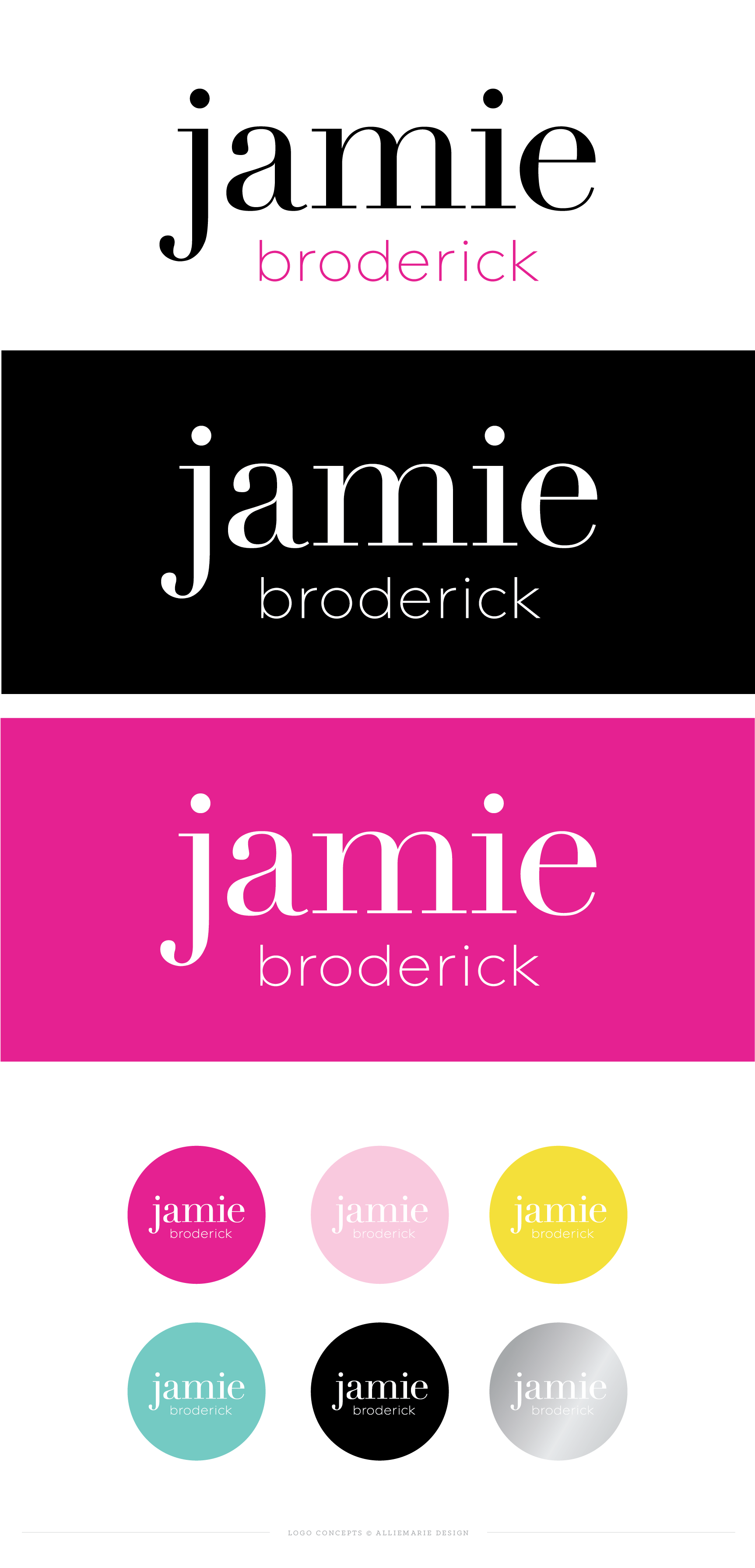
We knew the color palette would help give the slight edge and sassiness we were going for -- the black against the hot pink or teal has really nice contrast and great energy! However, to avoid being distracted by color and keep our focus on the structure of the logo concepts, I provided the designs in black and white first.

After reviewing these first three concepts, Jamie was attracted to the second two designs the most as they were a bit more on the sophisticated end of things compared to the first concept. After revisions, mixing and matching some specific elements, and experimenting with how the script fonts are used... we went in the direction of the third design concept. Simple, classy, and it really allows the colors to take center stage.
We chose black and hot pink as the primary colors because of their nice contrast and the feminine edge it gave the logo. Circles would be a recurring theme throughout the branding, starting with the circular logo variation with the fun dotted line and the more minimalistic submarks that could appear in any of the branding colors.
After discussion of how the logo and colors would work together, we decided to hold off on using a handwritten font within this main logo design. It became apparent that we needed a handwritten font with lots of personality to serve as a nice accent and "fun element" within the branding... that would come in with the full brand styling :)
After we solidified the logo design, I took the next step to develop and design the entire brand styling. I ensured we kept things simple with the submarks and watermarks, again allowing the vibrant colors to attract attention and give everything the perfect energy. The colors do this so well!
Adding glitter textures and design elements gives the visual branding some "glitz and glamour" that both reflects Jamie and her clientele. The script / handwritten typeface brings in a perfect amount of sassiness -- it's a great accent font to use for the digital program and retreat marks, as well as for other specific call-outs on her website to come.

I love how the digital program and retreat marks can exist on their own, yet they're still consistent in design and structure and cohesive under the Jamie Broderick brand. Having the foundation and "template" of sorts will make it easy to add additional marks to her line-up as needed in the future.
STEP 3: PRINT MATERIALS + SOCIAL MEDIA IMAGERY
One of my favorite parts of the branding process is using this library of design elements we've developed and creating tangible design pieces from them. I have a huge heart for print design and creating letterhead, envelopes, business cards and anything else my clients need is so much fun!
Jamie needed the basics and I enjoyed designing these fun business materials for her so she could feel confident communicating her brand to others both in person and in writing.

Next, I designed a set of brand launch imagery for Jamie, for use on Facebook, Instagram, Twitter, her newsletter, and beyond to help generate excitement surrounding her new website. I also created two different Facebook business page designs for her to rotate out as needed. All of these social media images were on-brand, using her branding fonts, colors, marks, and other elements from her brand styling...
... including her new branding photos! Jamie worked with Terree O'Neill Yeagle of The Moment Photography... and the photos are just perfect. The colors, style, and personality are spot on and they complimented Jamie's brand styling so well. I I loved using them as a part of her social media imagery and her website!


STEP 4: Website Design
We built a strong visual brand in the first two steps of our creative process. Step 3 helped us experiment with the use of color and layout, and now it was time for the website design which I consider to be an extension of your brand. Visuals should be cohesive, messaging should be clear, and the flow of the site should lead visitors smoothly through the content... encouraging them to take the action steps that will help Jamie meet her goals (i.e. sign up for a retreat, download an opt-in, contact her with a coaching inquiry, etc.).
In addition to working with Terree on her lovely photos, Jamie also brought on the lovely Marissa Polselli of Wordtree, LLC to lead the copywriting portion of the website creation. I'm so happy Marissa and I crossed paths -- she is not only super talented but also a joy to work with.
Marissa worked with Jamie on the site flow, simple wireframes, page organization, etc. while I, of course, focused on the design and offered guidance as needed pertaining to how the copy and the design would blend together. The three of us jumped on Zoom calls on a few different occassions throughout the process to ensure we were on the same page the entire time. There are a lot of moving parts when you're putting together a website -- working with copywriters can certainly make things go smoother and it's a whole lot less stressful for my clients when theyhave someone to make them sound good AND look good!
I just love how the JamieBroderick.com website turned out! It's a true extension of her brand... and it's a breeze for her to keep updated because SQUARESPACE. :)
home page + about page + services page designs
Photography: Terree Yeagle | TheMomentPhoto.com
Copywriting: Marissa Polselli | WordTree.net
I'm looking forward to following Jamie's continued success with this beautiful new brand and website. I'm sure she has many things up her sleeve that will wow her clients and followers! Be sure to follow along and connect with her:
Connect with Jamie
Facebook / Twitter / Instagram / LinkedIn / Website
YOU MIGHT ALSO LOVE…


