
Brand Reveal: Zion Covenant Church

When Zion Covenant Church approached me about collaborating on a new visual brand and website for their organization, they were preparing to go through a season of change.
Located in rural Ellsworth, Wisconsin, their strategic planning team had been working hard on their refreshed messaging and processes -- how they communicate their beliefs, how they connect and invite people into their community, and how they help guide members in their spirituality. They are dedicated to growing their organization in members, new believers, and ministries, and want to be known as the place in their community to come and grow in their faith.
I loved that they had already gone through this heavy "soul-searching" work before coming to me. So many businesses and organizations think of branding as your logo and visuals... when in reality, it's important to think about WHY you want a new visual brand and thinking about it from the top down. Because...
Your brand foundation should inform the design of your visual identity, not the other way around.
With their brand foundation solidified and all the big picture and oh-so-important important questions answered (who they are, what is their mission, what are their goals and dreams, what makes them unique, who are they trying to reach, etc.), we dove into the creative process with a clear vision.
Step 1: Brand discovery + INSPIRATION GATHERING
During their strategic planning, Zion Covenant wanted to find a way to simply describe what they're all about and explain to members how their process works in terms of spiritual development. They developed a meaningful tagline that spoke to their beliefs and process, as well as connected to their rural community: Plant, Grow, Harvest.
Plant (Meet Jesus)
Planting a seed of faith in the hearts of people
Grow (Follow Jesus)
Becoming more like Jesus
Harvest (Serve Jesus)
Sharing our faith with others
The experience they strive to give to their congregation? A new fresh approach to church life. A welcoming community providing a first rate Sunday morning experience with music, teaching, fellowship, and an approachable church "lifestyle" that's simple to understand. Zion Covenant is a place where everyone can feel comfortable, while also offering a new experience that may be quite different from the church many people grew up in. They want to be known as a church that has direction and is going somewhere.
Their new look for the organization needed to be fresh and clean, while authentically connecting to their rural farming community. Their church has history but they are also alive, growing, and focused on the future. So, although it was important to them that we develop a bright, modern, minimal, and joyful visual brand, we also had to keep their audience in mind and find a way to visually connect with their community and culture in Wisconsin.
My job was to take this vision and translate it into something visual -- a full brand identity that they would use to represent their mission and communicate authentically to their current church community and potential members.
I started by creating a mood board and color palette. It's farming and family focused, representing a simple lifestyle that's also colorful and full of life. I also incorporated simple graphics that Zion loved and could potentially serve as inspiration for icons that would connect back to their tagline. We were off to a wonderful start.

Step 2: Design + STYLING
After solidifying their mood board and color palette, we moved on to logo concepts. Zion Covenant decided they definitely wanted to move in the direction of using icons to represent each word in their tagline (Plant, Grow, Harvest). It was fun to experiment with different icon styles and how they worked with the logo designs! For the logo itself, I set out to play with incorporating a cross or some sort of plant element to connect with the icons and bring everything together in a unified way.
Below is a peek at the three logo concepts I provided them, along with how each direction could develop into logo variations, submarks, tagline marks, and icons. Click on each to see them a bit larger and look at the details:
Zion Covenant's strategic team eliminated the first concept, as it didn't feel contemporary enough for their vision. They loved the wheat made into a cross in the second concept, especially the bottom middle design where the church name is stacked. They were also drawn to the bottom left watermark in the third concept, along with that concept's style of icons.
I'm all for mixing and matching different design elements, as long as we can find a way to make everything work together cohesively with typography and style -AND- the final design still fits well with the original vision. We were able to accomplish this with some revisions and tweaks! After playing with color, we landed on a beautiful logo design and set of icons that feel unified and represent the church's vision for a simple, modern and thoughtful design.

From there, we moved on to develop accompanying marks, textures, and patterns. I thought it was very important that we incorporated the cross within their main watermark to ensure the memorable symbol has a strong presence throughout the church's branding. However, the Zion Covenant team just loved the mark from the original third concept, which uses the wheat icon in the middle and emphasizes the "harvest" part of their tagline and spiritual process. So, we decided to keep both in the final brand styling!
I designed an accompanying pattern with the icons, to be used as a fun background that further emphasizes the tagline and mission of the organization. A rough blue texture was developed to bring in a subtle earthy feel -- perfect to use as a background on slides or graphics used during Sunday morning messages, and elsewhere.
Lastly, I created program logos for their youth ministries, FUSION and ZionKids. I brought in a new font here, to make them stand out from Zion Covenant's other logos and marks. The slab serif and rough letters give the marks a casual, friendly and kind of earthy vibe while the colors, circular variations, and use of the wheat icon help bring everything together and make the marks fit well with the rest of the brand styling. I love these -- so fun and perfect for representing their youth ministries.
Okay, enough talking... here's a look at the full styling!

Step 3: Print + Social Media Imagery
After wrapping up the full brand styling, we moved on to create print materials and social media imagery to ensure Zion Covenant was consistent in how they rolled out their new brand.
I love how we incorporated the patterns into each of the print pieces (again, reiterating their mission and tagline!) and used the icons on the business card and back of the notecard. The strategic team decided to only have one business card designed for the organization, which everyone uses... a great way to save on design and printing costs!

Zion Covenant wanted to become even more consistent on social media and further connect with their members online, so it was important for them to be equipped with beautiful visuals highlighting their fresh and new visual identity. I created a few Facebook page designs and a set of Brand Launch imagery to help them spread the word about their new website once it launched.
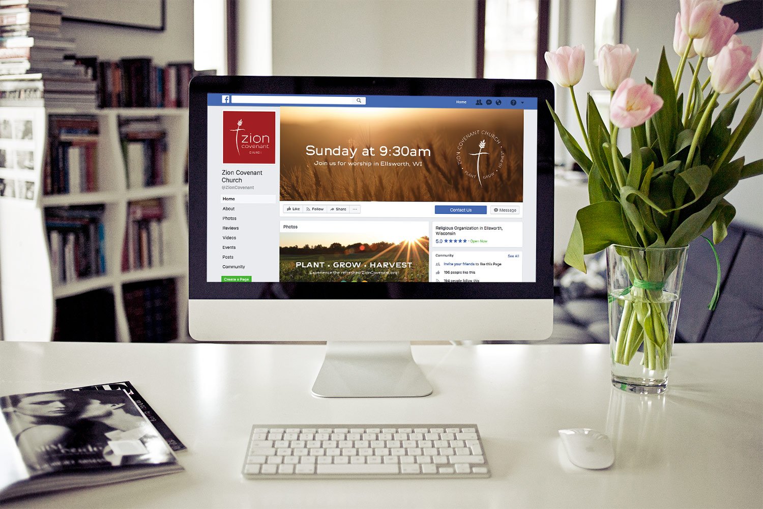


OH and how about those amazing farm and agricultural photos from Unsplash! I worked with Zion Covenant's strategic team to select a collection of photos from the stock photo site that we'd use on their website and social media imagery. They couldn't have been a more perfect fit with their brand and a great way to connect with their community members' rural lifestyle.
I packaged up all their final branding files, style guide, and social media imagery as well as prepped all their print files for the printer. The church quickly started implementing their new visual identity in their building, going all out with new signage, t-shirts, slides for their worship and services, bumper stickers, and more. It was so nice of them to send me some samples so I could hold this stuff in my hands!
Step 4: Squarespace Website Design
Now that we had a developed a consistent visual brand, we dove into the the final phase of our project... Zion Covenant's Squarespace website design!
As always, we started by developing a website strategy first. We talked through what they liked and didn't like about their old site, the most important things to convey when someone first lands on the home page, and how we were going to attract new potential members while also serveing their current members as well.
Similar to your brand foundation informing the design of your visual identity, YOUR organization's goals and strategy should inform your website design.
The three most important things Zion Covenant wanted people to learn and see on their new website:
1. Learn about who they are
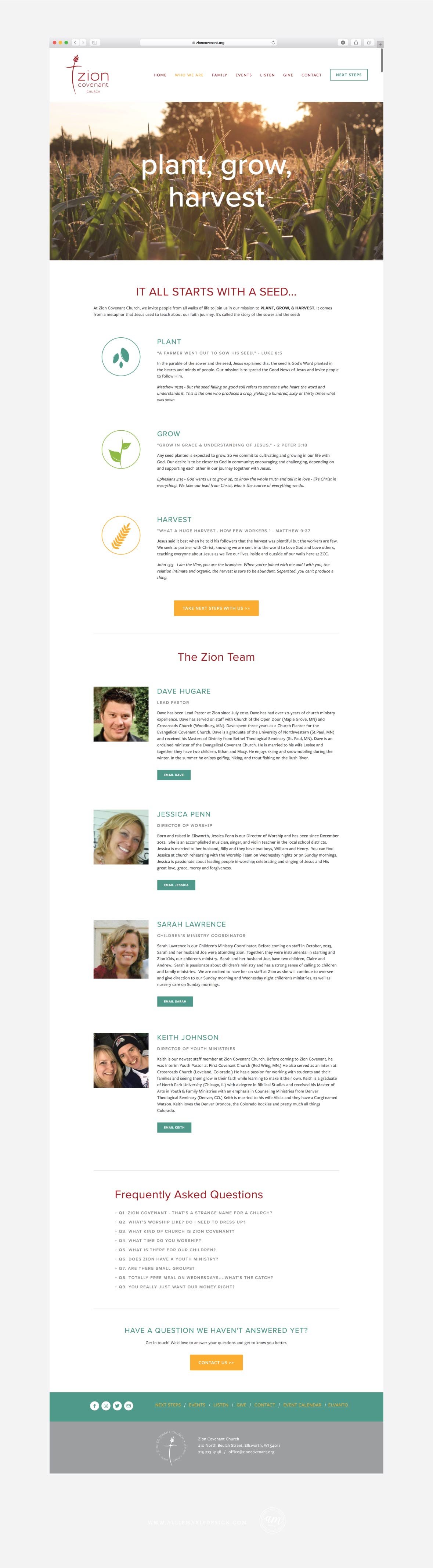
Visit the "Who We Are" page, learn about their mission and "Plant, Grow, Harvest."
2. Listen to the message series
Listen to the current worship and teaching audio to get a feel for their Sunday morning service.
3. TAKE NEXT STEPS
Visit a "Next Steps" page that talks about the church's services, ministries, events, and opportunities to get involved.
Other big improvements from their old site they wanted to make: (aside from the overall design):
A better way to showcase their events, so both new members and current members can easily see what's going on at the church on a daily basis.
More accessible email captures for new members so the church can follow up with new attendees.
I took all this information and went to the drawing board, designing a website in Squarespace that implemented the church's beautiful new visual brand, met their goals, fit their marketing needs, and brought their online presence to the next level.
As I've said before in other brand reveal posts, I view a website as an extension of a brand. It's your online hub or home. It very well could be a visitor's first point of contact with your organization and it's important to make a good first impression? I think Zion's website makes a beautiful first impression and is a true extension of their brand -- welcoming, friendly and honest, and the heart behind their mission really shines through.
What's more is Pastor Dave and any other of their team members can update it sooo easily -- within minutes -- which is a huge change from their old site. I can see they've been keeping the site updated with uploading audio files for their message series, adding community events to their church calendar, and adding new photos taken as a part of their volunteer programs and ministries. I. Love. Squarespace. And I love that the ease of making changes and updating can completely transform my clients' day-to-day workflow.
HOME + WHO WE ARE + CONTACT PAGE DESIGNS


YOU MIGHT ALSO LOVE…


