
Brand Reveal: Thrive Life Coaching

The lovely Karen Johnson approached me this past summer about a logo and visual brand for her new endeavor, Thrive Life Coaching. Karen is a dear friend and one of my favorite people, so naturally, I was thrilled to work with her and create something beautiful together. What I didn't know was just how much fun we'd have during the project and how beautiful this brand would become. It was a true collaboration and I'm very excited to be revealing it.
Karen helps her clients get from where they are to where they want to be. Her coaching is forward-focused, relational and authentic. She creates an empowering experience that "allows the client to discover meaning, gain clarity, explore possibilities, align values, engage passion and integrate action, achieve goals, and find balance." So, when we set out to create a logo and visual brand for Thrive, it was important for us to "communicate the potential for deep, significant growth."
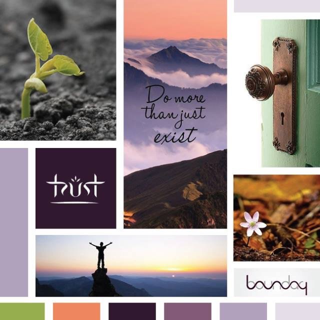
Thrive Life Coaching's Mood Board
I don't know about you, but I find those objectives very inspirational. These are Karen's words from her Branding Workbook, which I have all my clients fill out prior to starting the design process. This part of my branding process is so important, as it 1.) Helps the client start thinking about their business from a visual point of view and 2.) Helps me learn more about their goals, ideas and the direction they want to head. Karen basically rocked it with her Workbook and it set us up for success moving forward into the design process.
Karen's passion, inspiration and vision for Thrive Life Coaching shines through beautifully in this new visual brand. Take a look!

This brand has so much life to it! The color palette alone has gorgeous depth with the gradient of purples, while the green and tangerine colors bring a springy energy. The elegance of the deep purple, Roman-esque letters in "Thrive" is contrasted with the liveliness of the green "V" - these letterforms show a sense of both stability and growth. The submark and patterns bring a friendliness to the brand styling without causing it to loose depth, and I just love the typography...a great blend of modern and classic.
Lastly, the use of the purple/tangerine gradient was something Karen and I really wanted to incorporate in some way, as it portrays the sense of growth and enlightenment so well. As a background and within the vertical and horizontal line elements (all Karen's idea!), I think it's a final touch that wraps everything together perfectly.

The use of the tagline is another thing that sticks out to me about this brand. "Discover. Embrace. Grow. Thrive." These words tell a story and represent the process of working with Karen so well and so concisely. I love how we incorporated it into the submarks, buttons and patterns.
Next up: Thrive Life Coaching's new Squarespace website! We're working hard on it this month and have a launch set for later this fall. Can't wait to see the brand come alive in this way.
UPDATE: Thrive Life Coaching's site is live! Check it out.
YOU MIGHT ALSO LOVE…


